montage theory
|
|
montage theory first originated from Russian film makers in the 1920s, this was spoken about especially by Sergei Eisenstein, the theory is of how two shots collide with each other, the antithesis and the thesis become a synthesis, they synthesise together. The relationship that we can see when two images sit next to each other and collide differs only slightly from the original theory of montage as it was based of videos in films.
|
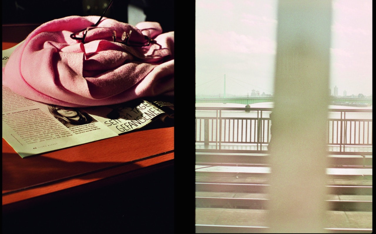
Two-frame films/diptychs
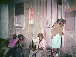
The idea of two frame films is similar to the montage theory but slightly different at the same time quite different, two frame film is basically two images put next to each other in the same frame, and in some sort of way they have a connection, whether its close or slight, they have some form of connection, this is often about other parts of the image other than the subject and main focus, it can be about aperture, the colours on screen, when they were taken, why they were taken. etc, the example below is one that I found on the photopedagogy website, these two images relate that they were taken one after the other, we can see that the focus of the image and subject is not related in any way which helps to prove that it doesn't even need to be related in a way that is noticeable visually.
|
This is taken from Luke Fowlers book, two-framed films, 2006-2012, the relation between these two images is they were taken one after the other, It is interesting that images don't have to be related visually at all.
|
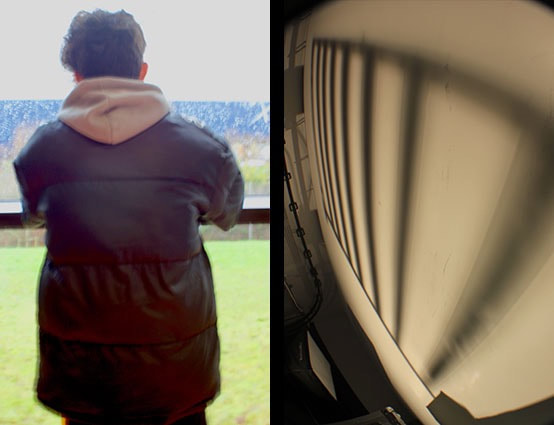
class work diptychs
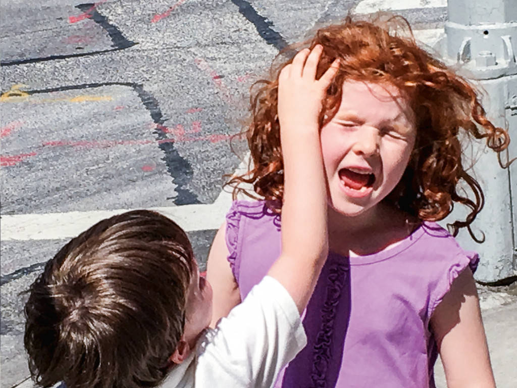
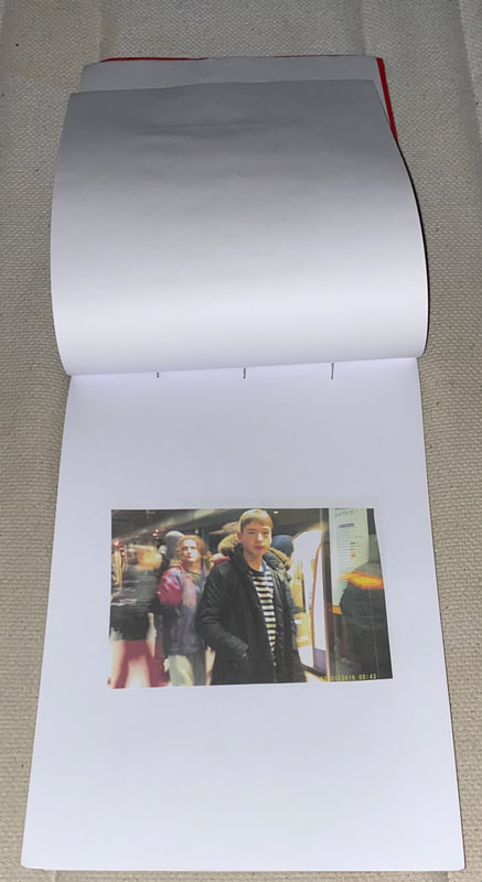
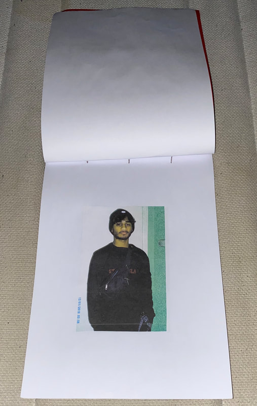
In class we were given a sheet numbered from 1-14 each number had it's own instruction as to what to take a picture of. We were then asked to get a number generator up on our laptops and make then numbers 1-14 so that then you have whatever number you are given and it is completely random. The numbers I got were 9 and 10 which were to take an image and at the same time make a shadow look distorted in the image and the other instruction was to take an image of someone looking away from you out of a window. I found taking an image of a distorted shadow to be slightly harder then the second task as I used my fish eye lens that I have from home which distorts images anyway, I decided to do this in the studio where there is more than enough lights that can cast very dramatic shadows which were perfect for the task I was doing. The second task however, was a lot more easy as I could find a mood much easier and play around with it a little bit, in this image I just wanted to take a sad image of someone looking away from me out of a window, this was made easier by the fact that there was rain drops on the window.
That is how I made the two-frame film that you can see below, the two images are related in that they were both taken from the same sheet of instructions and were both chosen at random, in this way they relate which isn't visually at all.
That is how I made the two-frame film that you can see below, the two images are related in that they were both taken from the same sheet of instructions and were both chosen at random, in this way they relate which isn't visually at all.
More of my diptychs
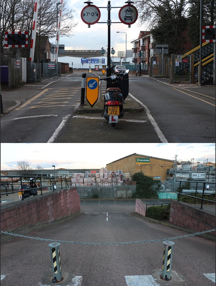
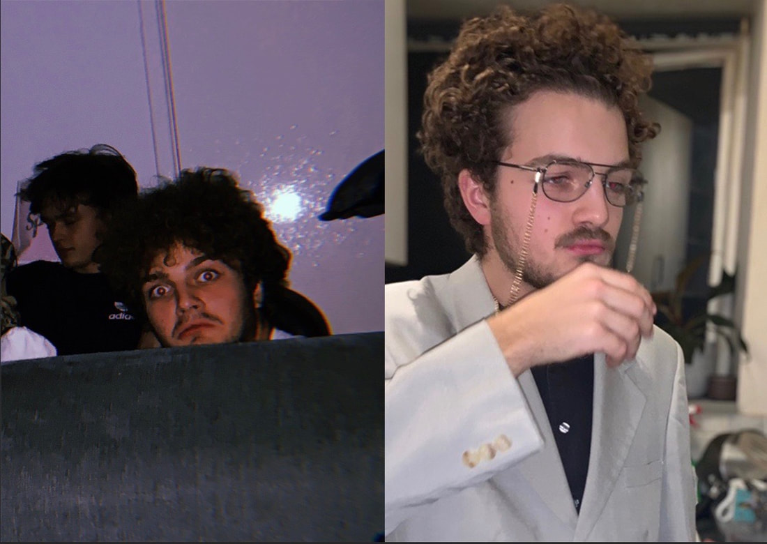
photo zines
Zines in photography are a way of presenting images in a small booklet, they are easy to make and can be made in different ways. This is an interesting technique because of how easy yet effective it is.
Zines originated in the 1930s amongst small fan bases and communities and were used as a method of self publishing for people who didnt nessacirily have enough money to promote themselves in a book, they were mostly used at this point, similarly to comic books and magazines, which in fact is why they are called zines, short of magazines. Throughout history they have been used for artistic purposes and for commercial, they were used in this way to get information and used as a quick, cheap method of promoting.
Zines originated in the 1930s amongst small fan bases and communities and were used as a method of self publishing for people who didnt nessacirily have enough money to promote themselves in a book, they were mostly used at this point, similarly to comic books and magazines, which in fact is why they are called zines, short of magazines. Throughout history they have been used for artistic purposes and for commercial, they were used in this way to get information and used as a quick, cheap method of promoting.
my photo zines
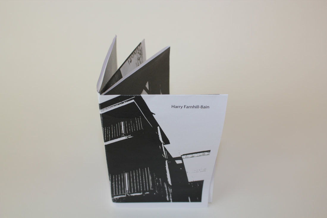
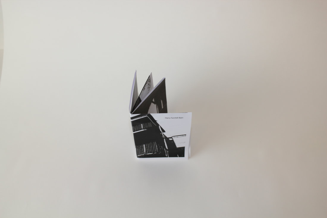
my first zine
this zine is the most basic type of zine you can make, I made it out of photographs for a different project that I have been doing as this was simply an experiment. I do not like this zine fold as much as others that I have seen and want to try as I feel it is the most simple way of making one or basic looking. Another reason that I don't like as much about this fold is the fact that I feel it is even the dummest down way of making a book in general, I do however, think that it is an efficient way of presenting images.
|
|
|
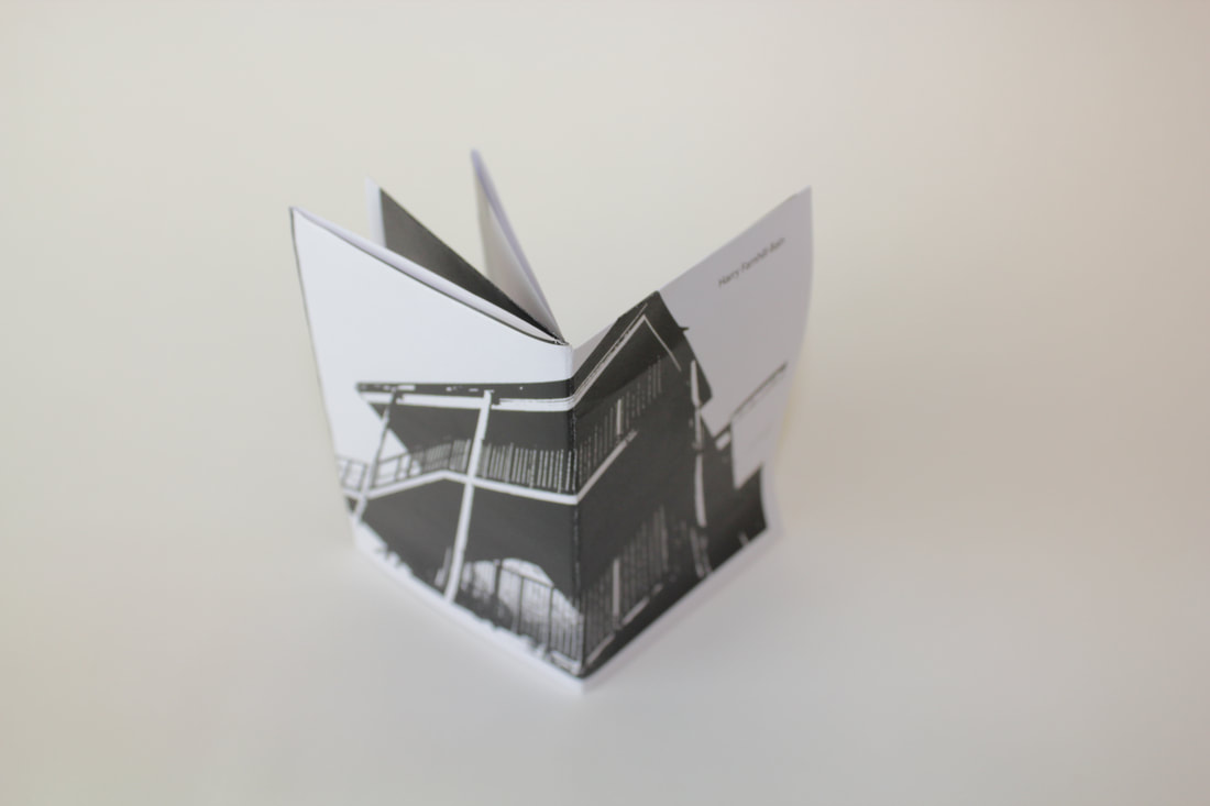
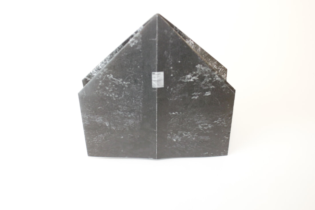
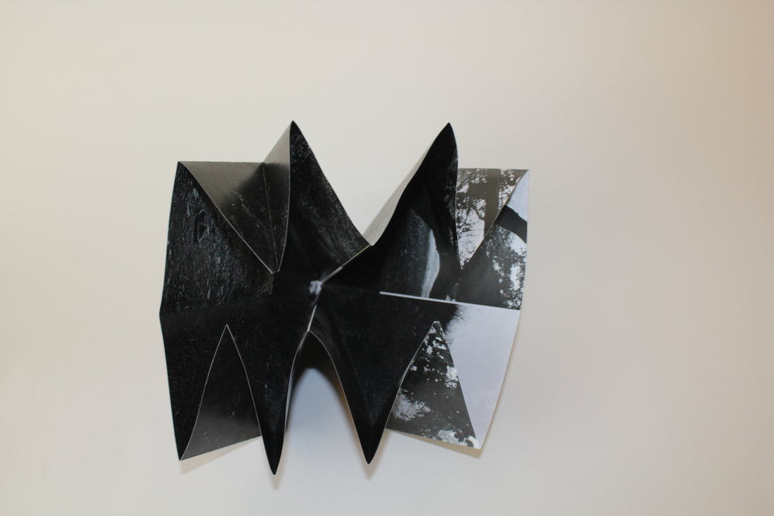
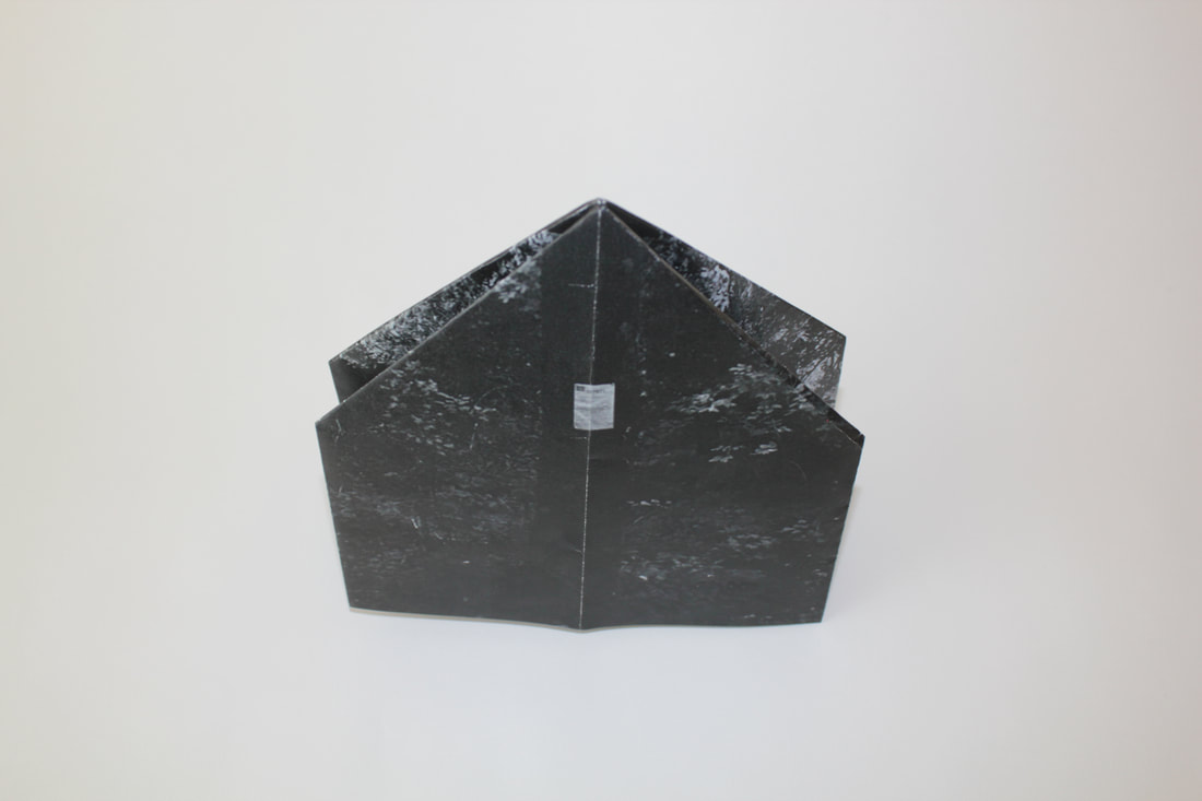
my second zine
This is a turkish map fold, I used images that I thought I could make work with this type of fold for a zine, this again was a set of images from a different project, this, is in my opinion is a better, more interesting way of presenting images to an audience, it is more complicated to make, more effort, time and practice goes into making it and in my opinion I think that it looks a lot better.
|
|
|
history of the photobook (important photobooks)
Anna atkins
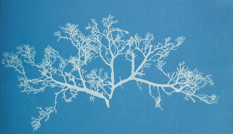
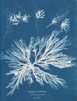
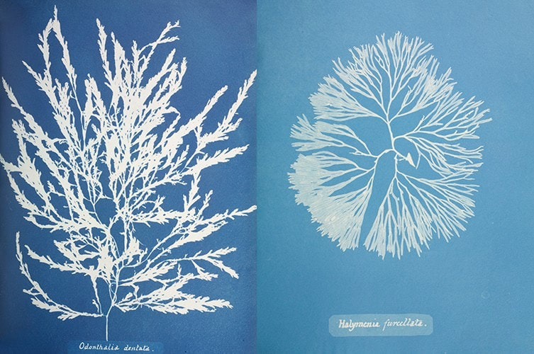
Photo books have been a popular way amongst photographers to present their work ever since photography became a known type of media. Anna Atkins, she is considered to have made the first photo book ever. She wasn't a photographer, she was a botanist, she made a book of several cyanotypes of different types of British sea weed, she called it Photographs of British Algæ. As suggested by the name, this book contained over a hundred cyanotypes of British Algæ, she didn't make them seem very different as she wanted there to be little individuality about the cyanotypes in the book so she made the positioning of each piece of Algæ very similar on the page. I think that the reason she wanted little unique qualities about each cyanotypes because she was simply documenting the plants, keeping in mind that she was a scientist not a photographer, so uniqueness wasn't something vastly important to her.
It is interesting that something considered to be the first photo book wasn't even made by a photographer, almost as if she was combining two common ways of presenting media, a cyanotype and a book.
I think that this is a perfect example of how photography doesn't need to just be about photographers work, most people will have some how made some sort of photograph in their life, it just wasn't as easy to get a camera image back then and it was more common than it is these days to use things like cyanotypes, negatives and photograms.
|
|
|
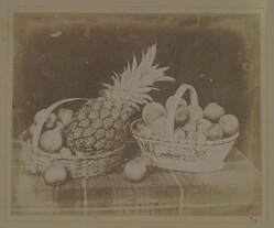
Henry Fox Talbot
This photo book un like Anna Atkins book was not produced for any purpose other than commercial and to make Henry Fox Talbot's experimentation in camera less photography public. This book was sold in multiple different parts during the 1840s. The books contents were almost like a study into different styles/genres of photography, including, still life, close-ups and images of buildings and constructions, he also included multiple segments of writing and illustrations. To make these images he used a type of photography called a calotype, this is a process which includes soaking paper in silver iodide and exposing it for a long time. His main goal was to promote the idea of photography one day becoming a commonly known form of art.
|
|
|
Jacob Holdt
Jacob Holdt's book 'American Pictures', published in 1977, is a book that contains 700 images that are depicting his journey through America with nothing but $40. During his travels through America he took thousands of images along the way and fully documented his journey, he stayed in a total of 48 states through out America and stayed with hundreds of different families whilst he was there. The images he took, which were shot on film, focused on more than just the every day American citizen, culture and life style, it focused on the corruption and harsh lives that a lot people were living amongst the working class of America.
|
|
|
The significance of the photo book in photography history and culture
The importance of photobooks is a lot bigger than I think is publicly realised, in the community of photography it is a different story and is a lot more openly known. The photobook takes a lot of forms and has done over the years. The different types of styles and reasons for making a photobook have varied and that is interesting to think about, in that photography as a whole went through a development from being a way of showing people something that they didn't see, whether that was a form of proof or just to have a memory. Then it developed into what it is today, an art form. Over time people realised how you could experiment with photography and it had a lot of different uses, why couldn't it be art ?
The photobook was originally for educational purposes, sometimes it was used as an alternative to illustrations in certain books and it was also used for advertising, this is how zines started, which is also, in a way a type of photobook, and it just grew gradually. A big turning point in its history was when photography was used in a more artistic fashion, this started with people taking a more creative fashion to their images and photography practice.
I think that the photobook has been important for widening the photography community and becoming more well known and giving people a voice who may not have necessarily had one before, books are a very good way at putting across a message to a wider audience and making your photography style and portfolio more well known, this is what has made photobooks into a significant part of photography.
modern photobooks
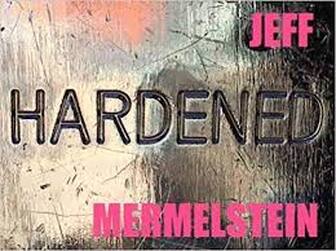
Hardened by jeff mermelstein
Assessing a book in a much more formal and structured way to what I would usually do would be interesting and a helpful asset to my page.
Subject matter
-What is this book about ?
This book is called hardened by Jeff Mermelstein the book is about 305 photographs that the photographer had taken on an iphone over the course of 2 years. The book is about taking images of people and things in a split second without them possibly even realising and this book is similar to that of a portfolio of images taken of people in the split second.
Cover design
-Really consider the image that was used for the cover as well as the cropping (or not) of the image, the placement of the title, the overall cover design.
The cover design I can tell it was taken on an iphone like the rest of the images. The photographs featured in the book are taken on an iphone and I could tell this before I found it out. When the camera on this type of phone zooms in, the image becomes different to most other cameras when zoomed in, it takes on this blurry/fuzzy sort of look, you can tell what the image is however, the resolution goes very far down in a way that is different to most cameras, thats how I can tell the image was taken on an iphone on the front cover. The image used I think also matches the name very well, 'hardened', the image is of some sort of scratched up surface, it looks like concrete but old and run down.
Strength of the photography
-what makes this collection of photographs stand out ?
For me the the reason that this collection really stands out is because all the images were taken on an iphone, which in itself is such a strange thought, he made a photo book with a camera built into his phone, people take their phones everywhere and can take images whenever, they want to of whatever, they want, if you were to skip back 100 years, photography would have been a very different thing, and I think that the part that is so intriguing to me is the fact that he made a 305 photograph long photo book with his phone.
Aesthetically, the images stand out to me because they are taken in such an anonymous way, they highlight such normal and every day scenes, he takes images that you could walk down the street and not think twice about, but at the same time it's as if he has taken the scenes and addressed them head on, making them seem more obvious.
-Does it communicate the photographers intention ?
For the most part I think that I highlighted what I thought his intention was in the previous question and if this was his intention, taking images in a very normal/average yet unique fashion then I think his intentions were highlighted perfectly.
-does the style of photography and camera technique suit the subject matter ?
The style of photography is very hands on and easy to understand, I think that not a lot of photographers could pull this sort of project off but Jeff Mermelstein has pulled it off to perfection, especially with the style of photography, I think that the camera technique influenced the style of photography vastly in that the camera technique for a lot of the images was trying to go unseen and not be noticed almost like he didn't tell who was the subject that he was about take the image and I think that the camera he was using, an iphone camera, allowed him to do this easily.
-Does the work feel amateurish or aesthetically sophisticated ?
In a strange way, the images aren't as aesthetically sophisticated as they are amateurish, the images aren't very visually pleasing in the way that many photographers are, but at the same time that is what adds to the idea of the book, the images were taken on a phone and this is one of the main reasons why the whole project feels very amateurish, the images were sophisticated in the sense that the theory behind them are very well thought through, as a whole but not so much individually.
Page layout
-Is the placement of the images on each page as well as the consideration of the entire double-page spread worth noticing ?
The images are entirely double page spread and go across the whole two pages without any boarders around the outside of them, this is very hands on and not very much design went into the layout of the images on each page, the way that the images are placed and sized in the book will make people interested because they are so used to seeing iphone images on a phone screen but when they are enlarged in the way that these images are.
|
|
|
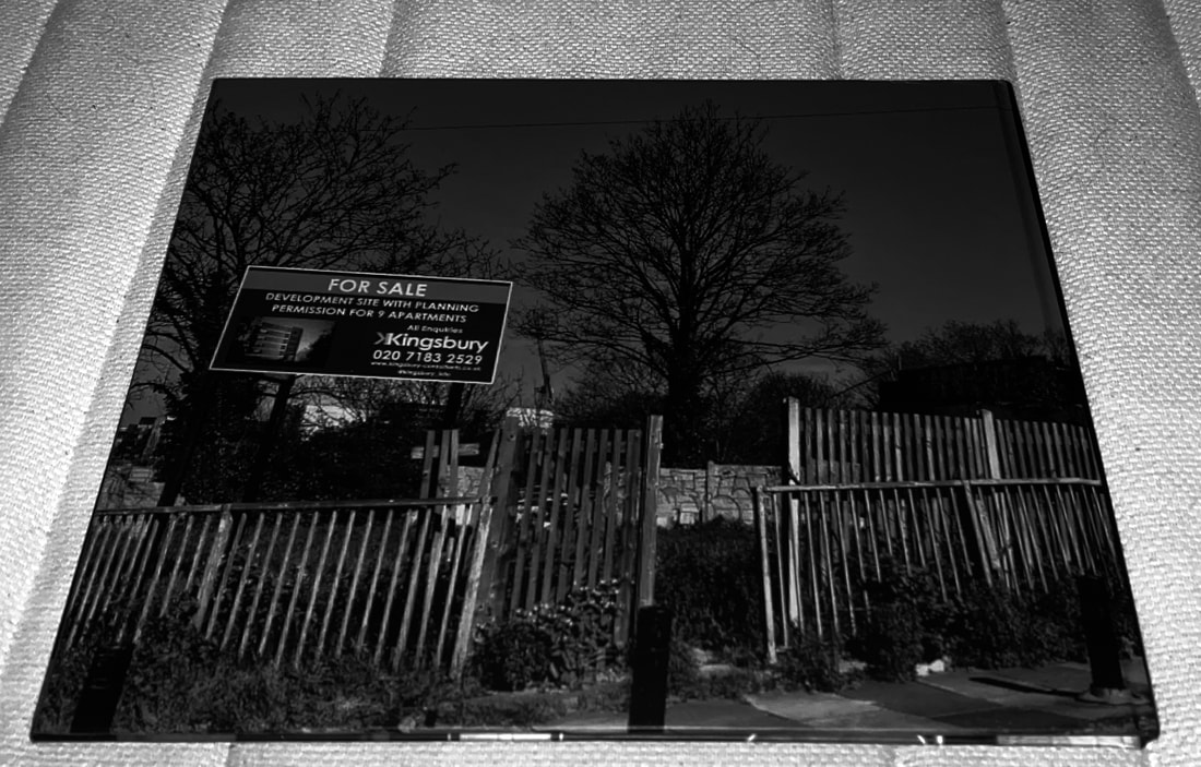
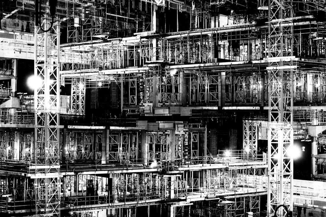
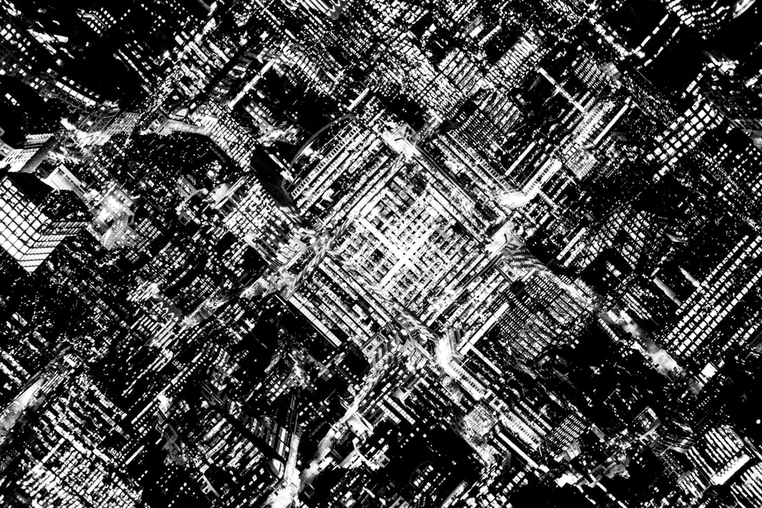
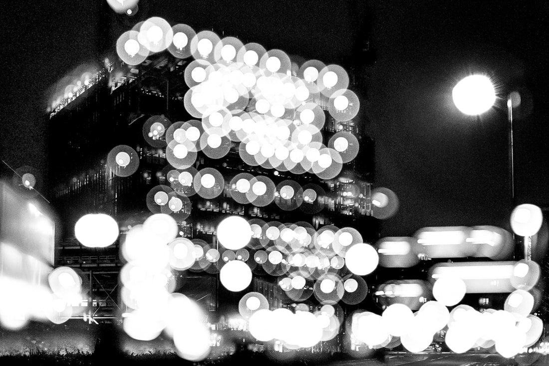
Metropole
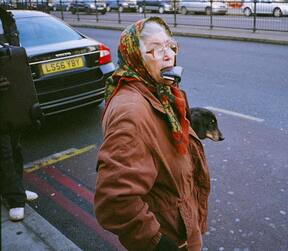
Metropole by Lewis Bush is a book highlighting the visual metropolis that is London. Lewis Bush in these images was trying to highlight and show the industrial side of London that is a prime example of the overpopulated, polluted modern world. The definition of metropole is the parent state of a colony, so this pretty much just means the capital city of a country, which London is. Lewis Bush relates the metropole side of it to the British Empire which London used to be the centre of, he says, "London was once known as the metropole or ‘mother city’ at the heart of a vast empire stretching across a quarter of the planet." In this book he brings out the modern style and culture that London has. The way that he did this was by taking distorted images at night of tall buildings and cranes, this was to make his images only highlights the industrial, modern looks of London, he also double exposes a lot of the images with more buildings and lights from buildings to catch the metropolis-like atmosphere of this photo book. What I took away from this book is that he is capturing very well the systematic lifestyle that comes with living in London, making people and everything inside this metropolis look robotic and controlled.
|
|
|
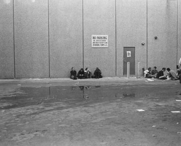
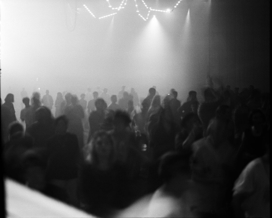
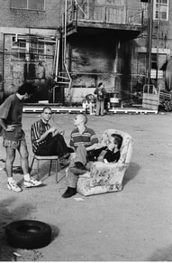
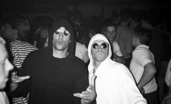
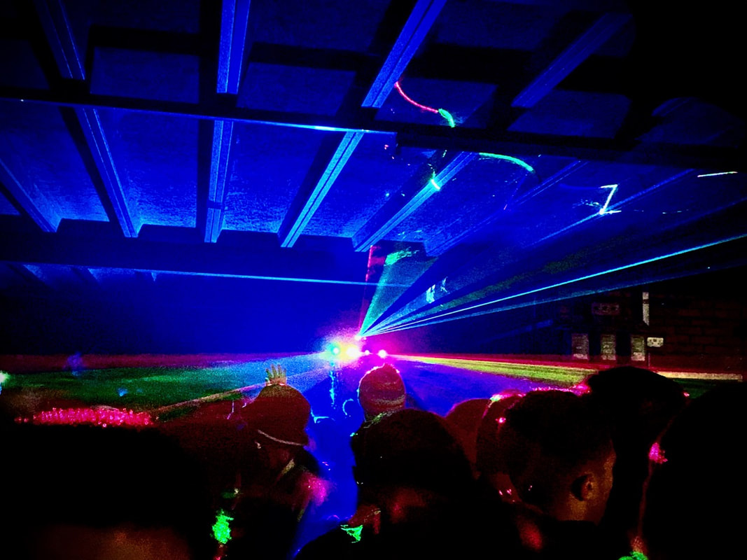
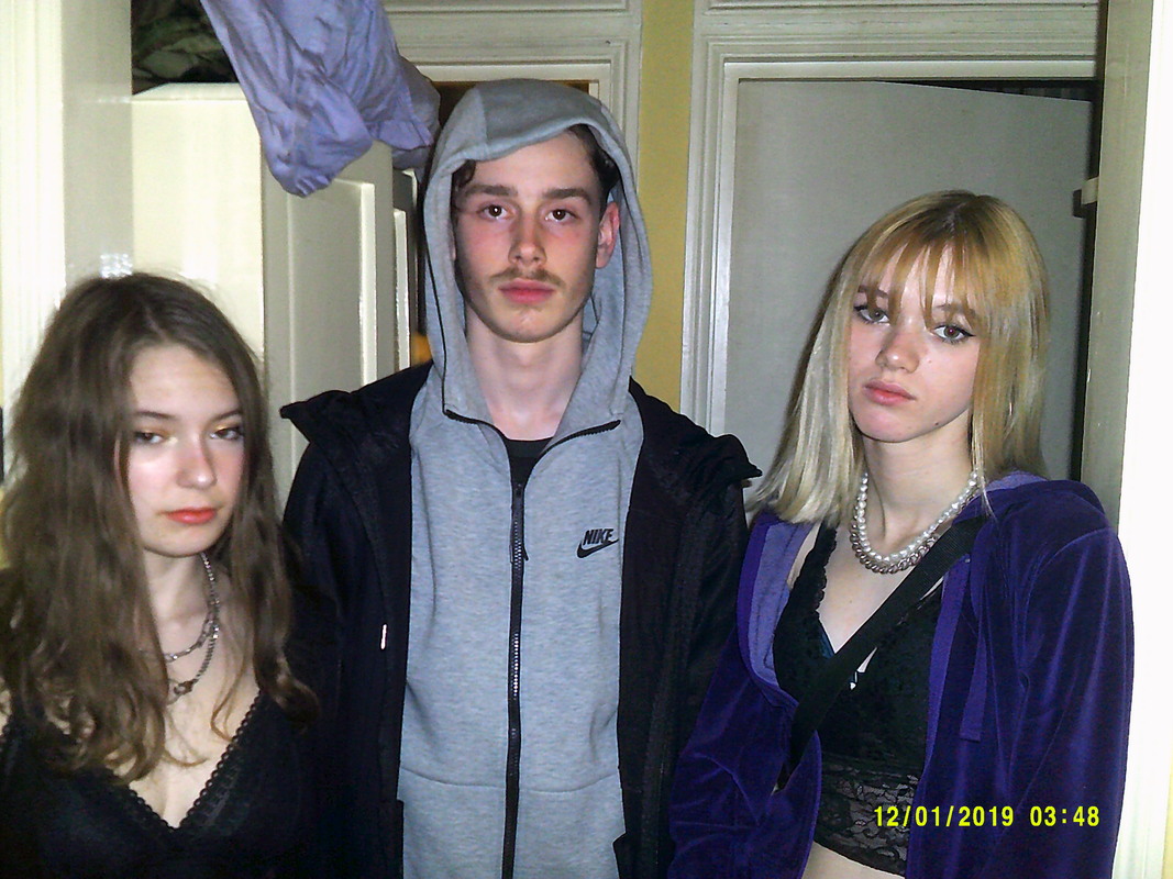
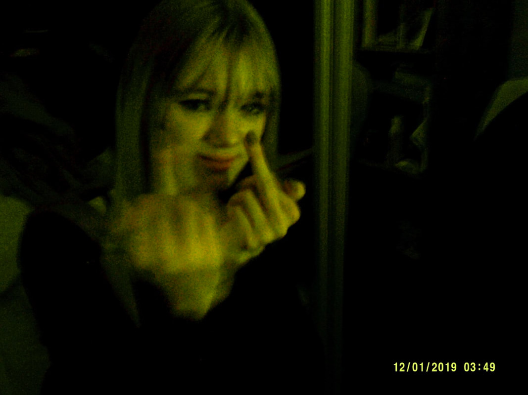
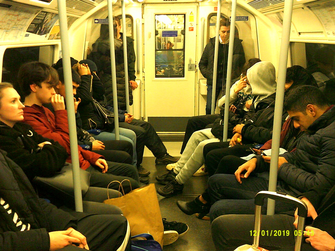
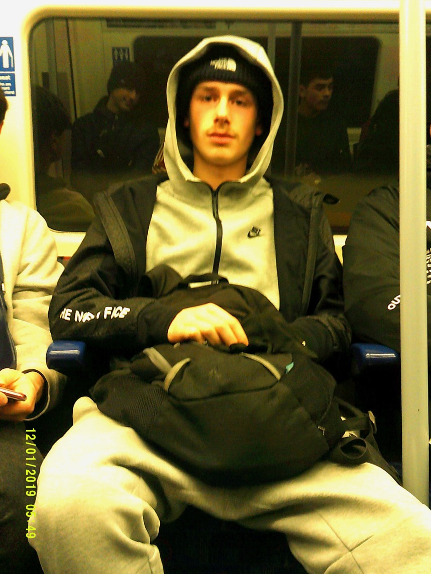
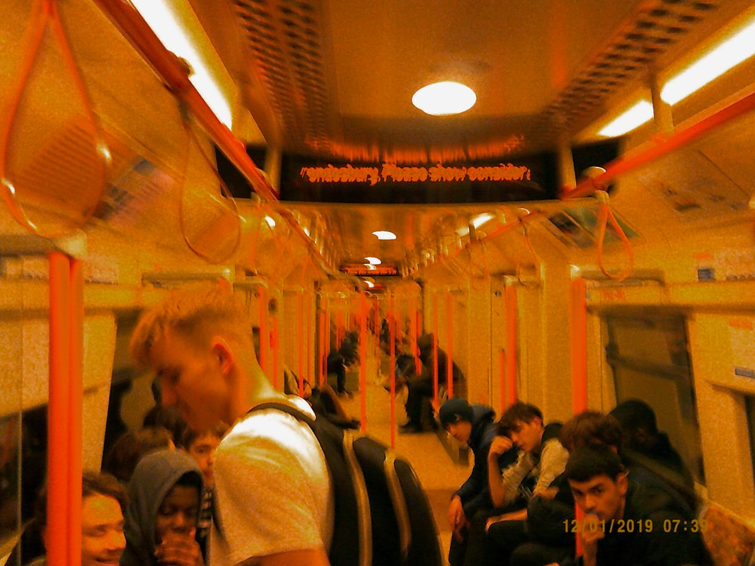
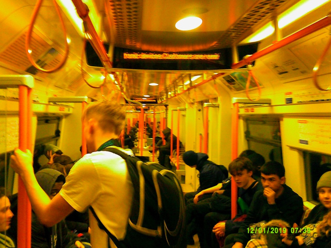
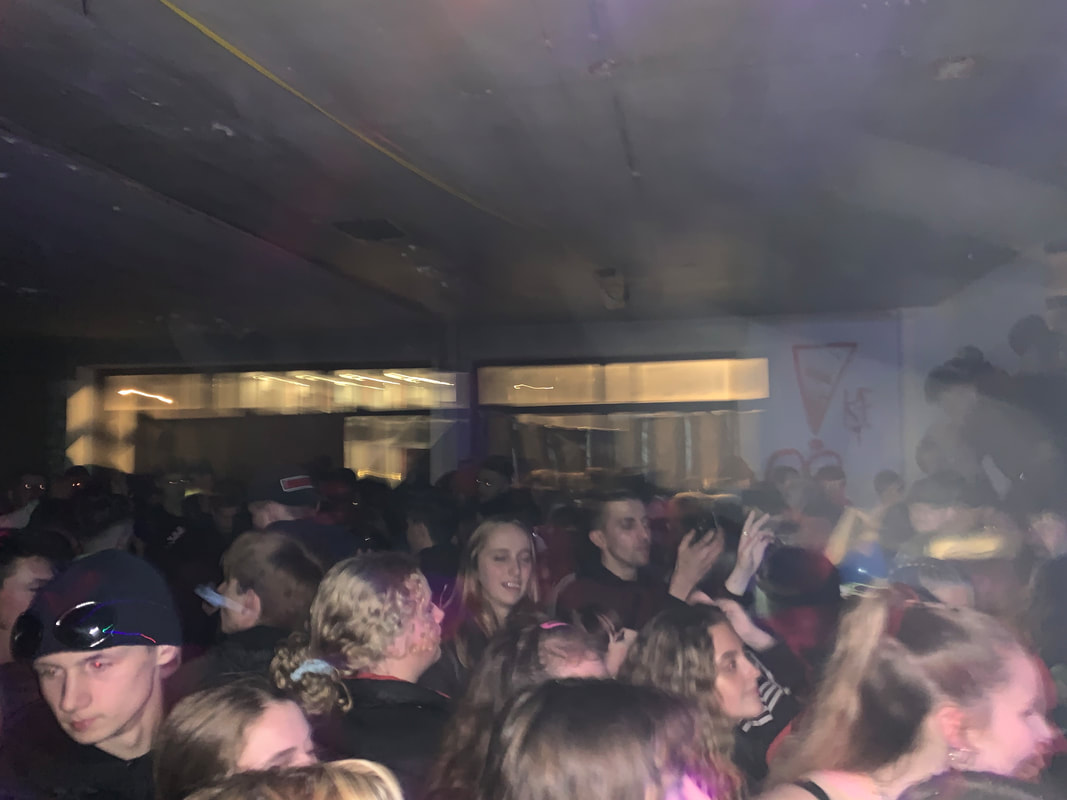
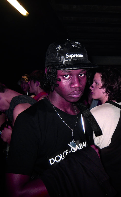
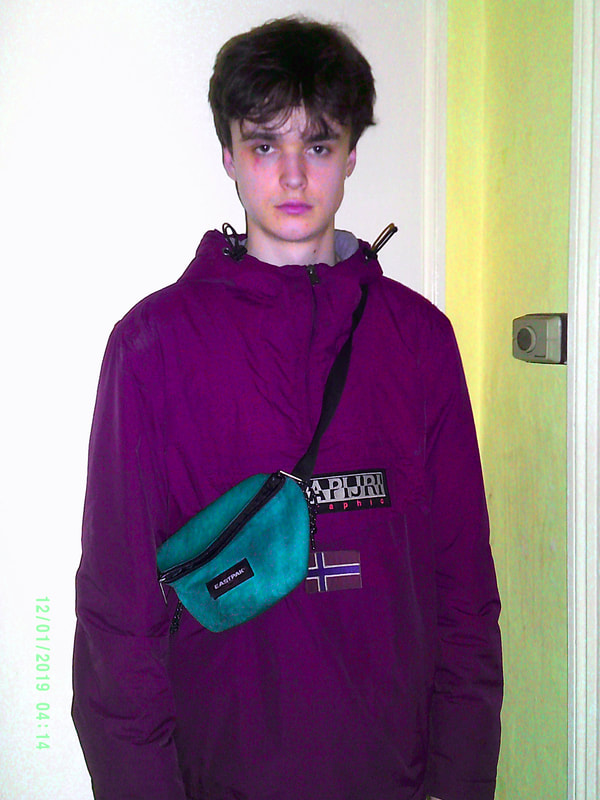
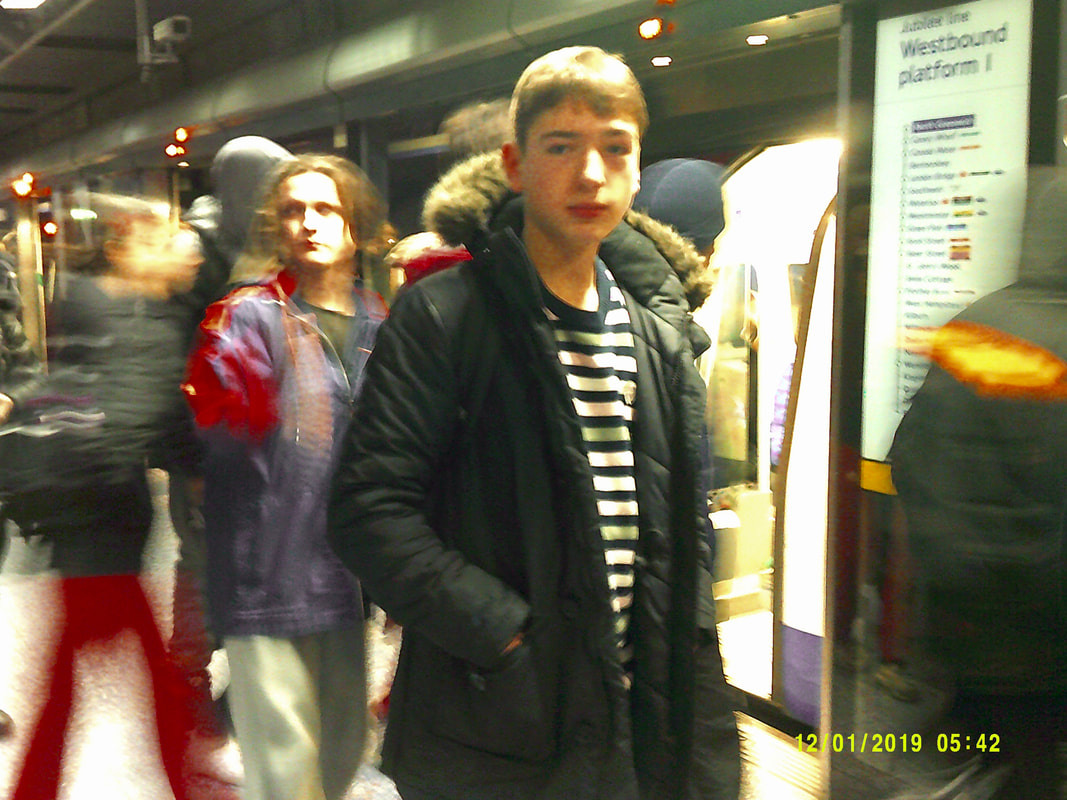
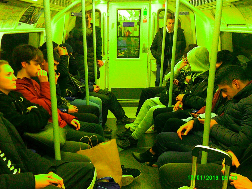
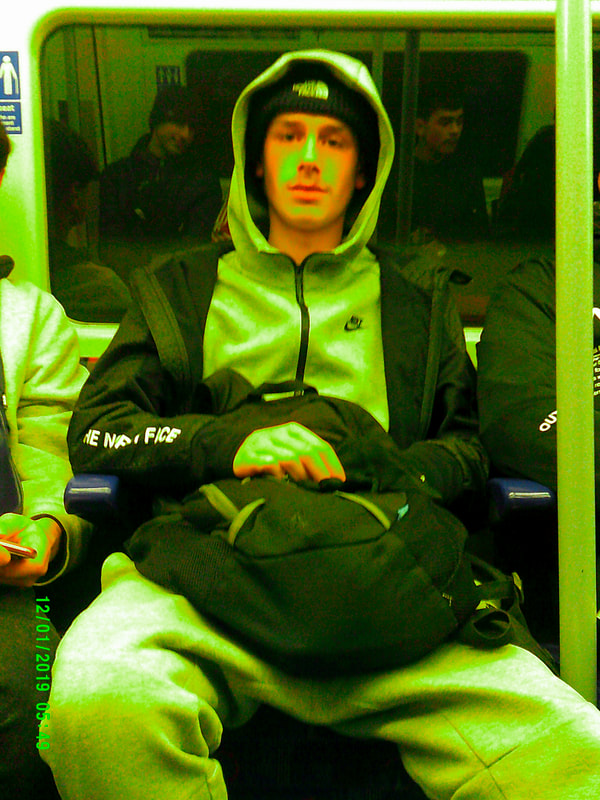
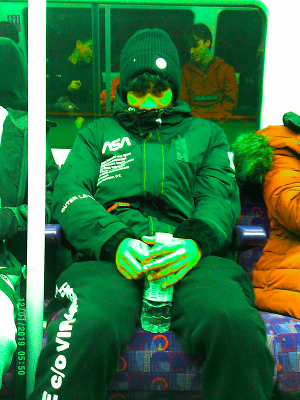
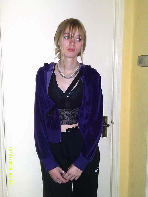
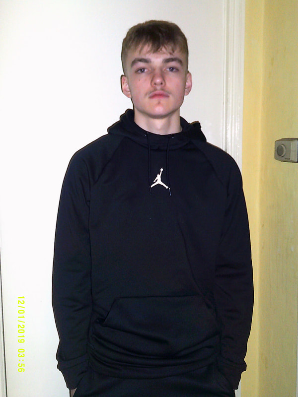
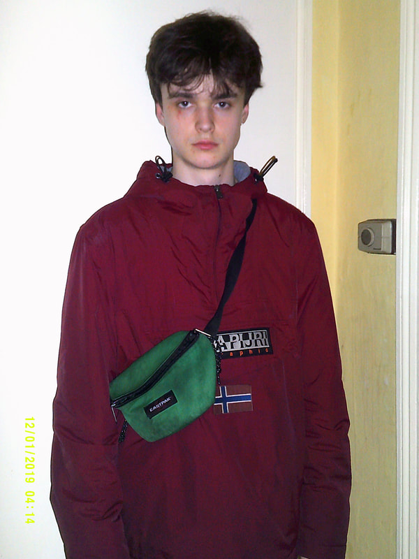
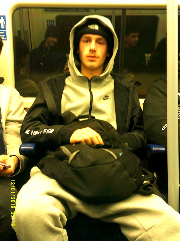
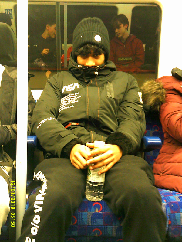
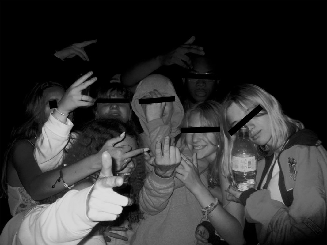
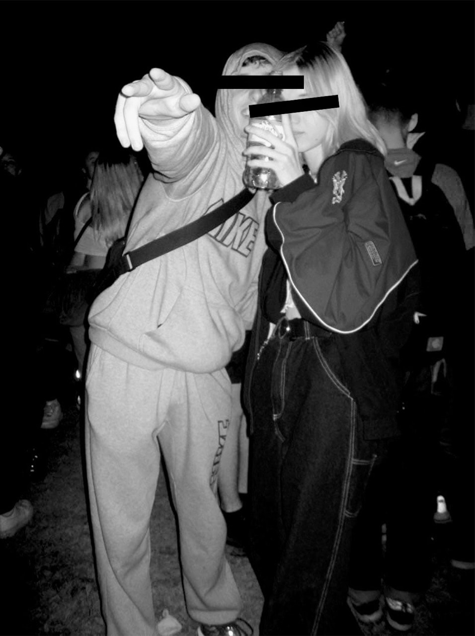
personal project: rave culture and fashion
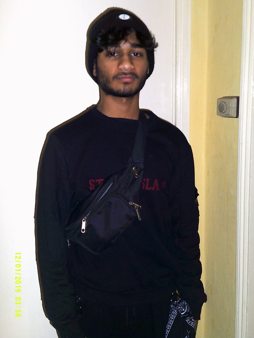
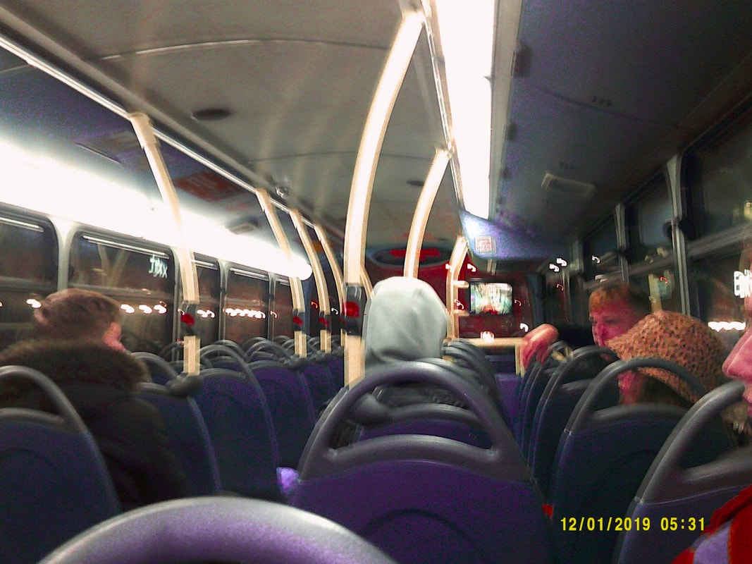
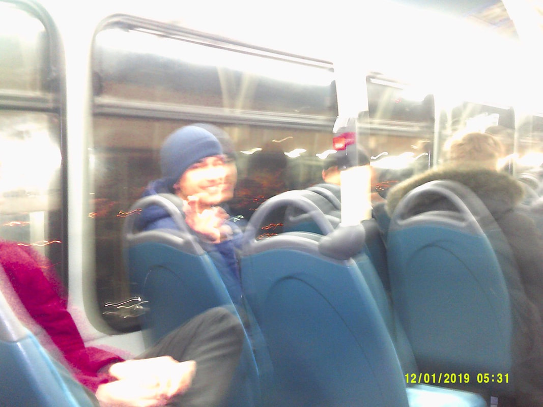
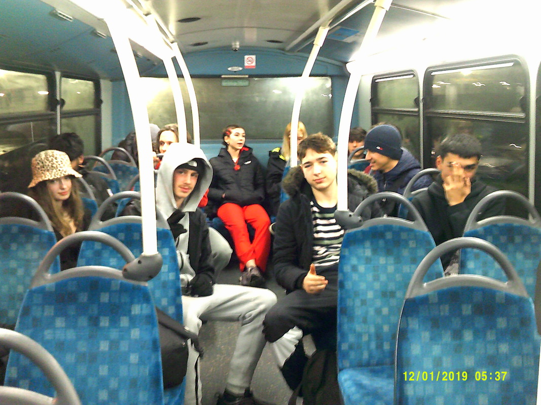
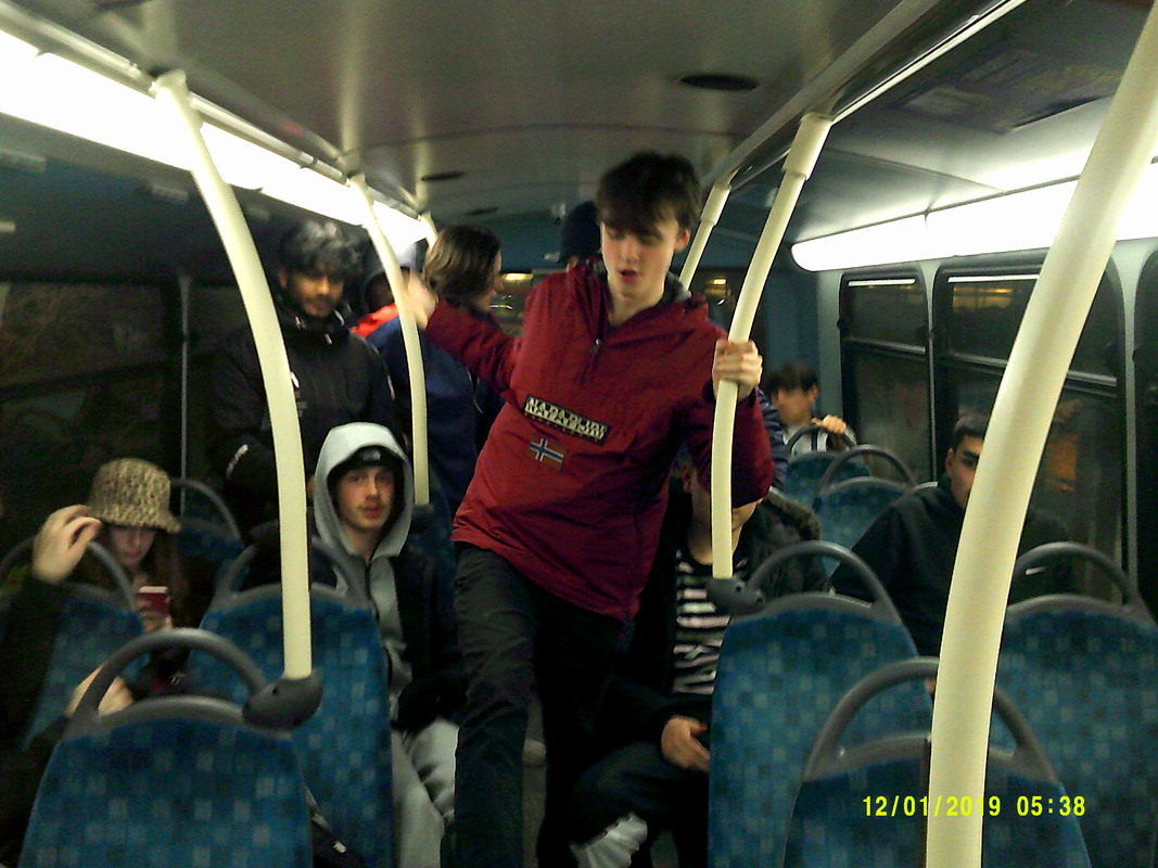
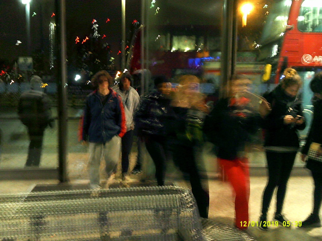
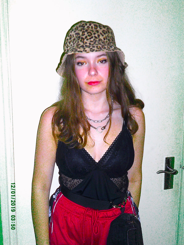
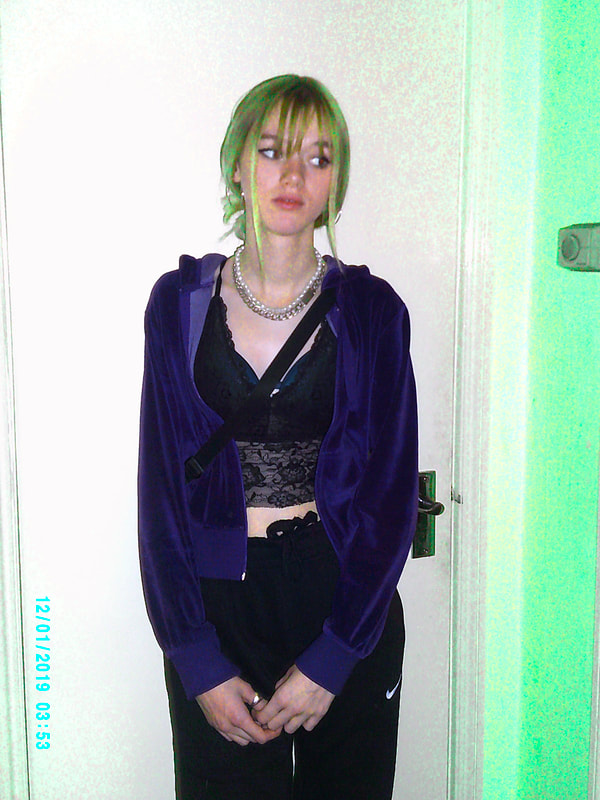
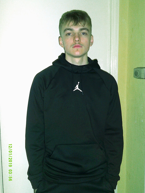
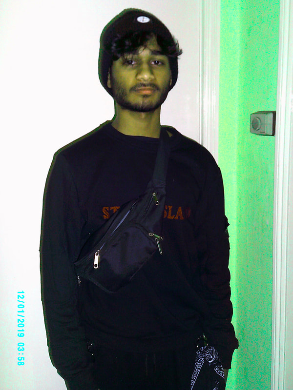
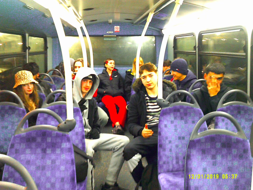
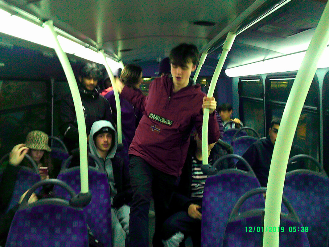
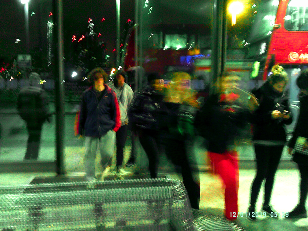
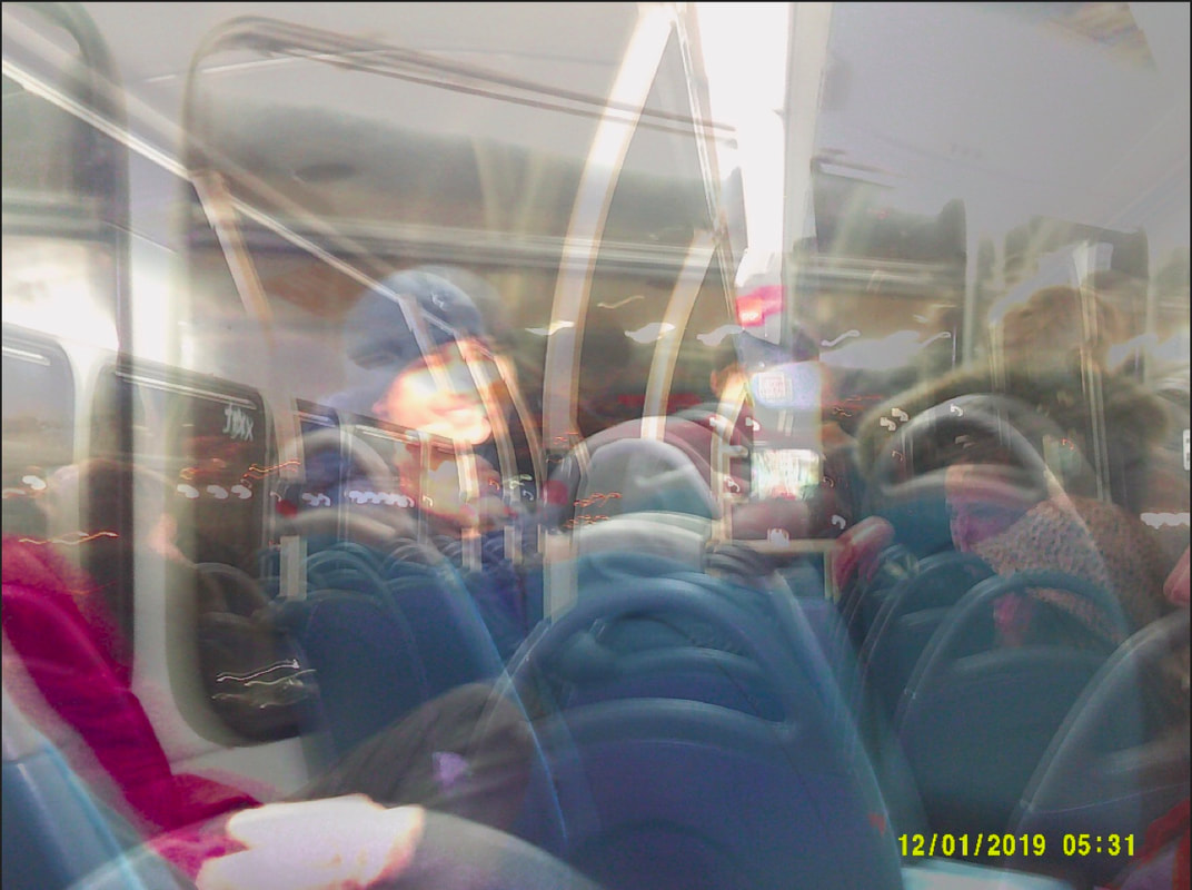
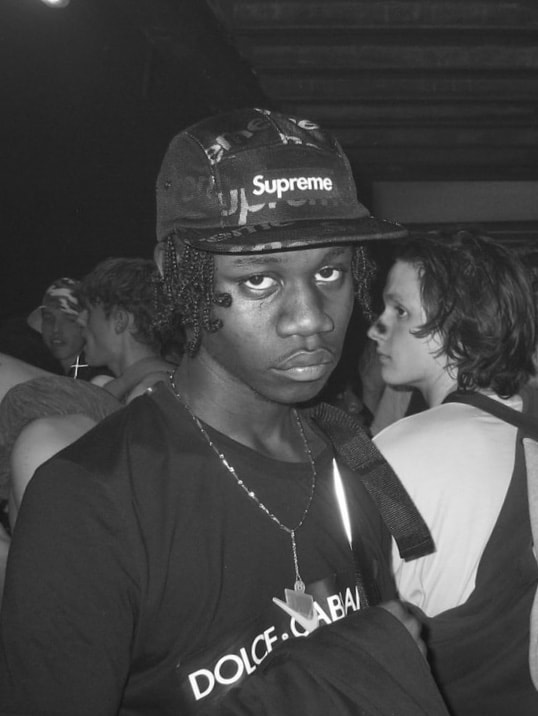
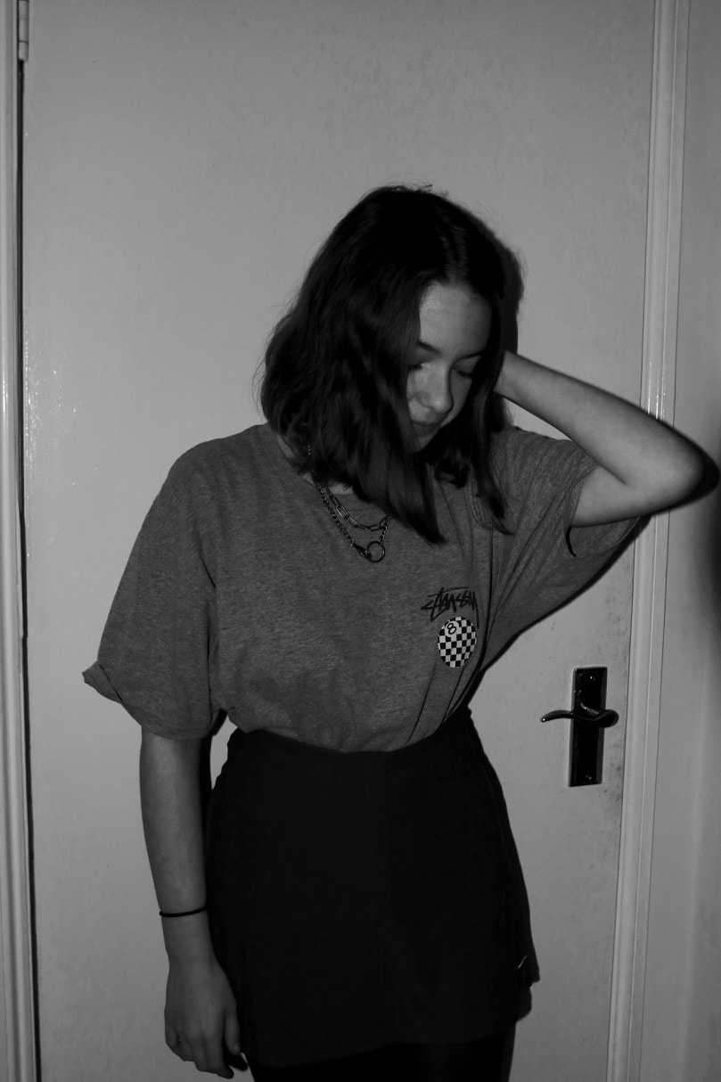
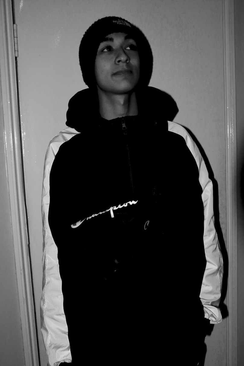
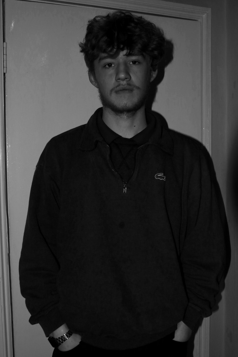
I have decided to make my personal project about Rave Fashion and Culture. For a while now this subject has interested me, and I thought that it would be a very fun thing to photograph and get creative with. What I mean by Rave Culture is, the rituals that are involved in the event, the type of people that go, the way that people act, what is involved in going to a rave, etc. The UK rave community is very diverse and strange, the type of people who go are not afraid to take the risks involved in going to a rave and there is thousands of people in London and the UK that attend them. Ranging from the ages of around 15-30, although the large age difference, allegedly people don't tend to be bothered by it. From what I have heard, I can make a small conclusion that majorly people go out raving for a good time and don't particularly care who they meet along the way. I think that one of the most intriguing parts of the whole scene is the rituals surrounding the act of going to a rave regularly, from a photographers perspective, this is one of the main aspects that I am going to base my pictures off, people say that, they always use the underground, without fail when they are going to raves, they always meet new people, they are always in a crowd and are used to being crowded by people, they always hear very loud music, etc. What I want to achieve with the ritualistic side of this is find one thing that happens every time people go to raves and have elements of that dotted through the book.
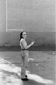
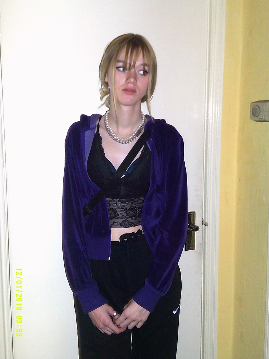
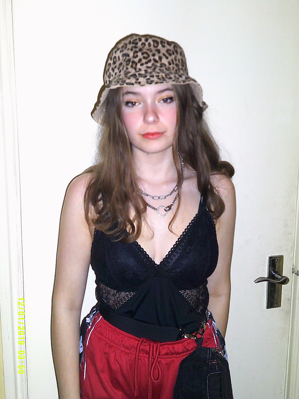
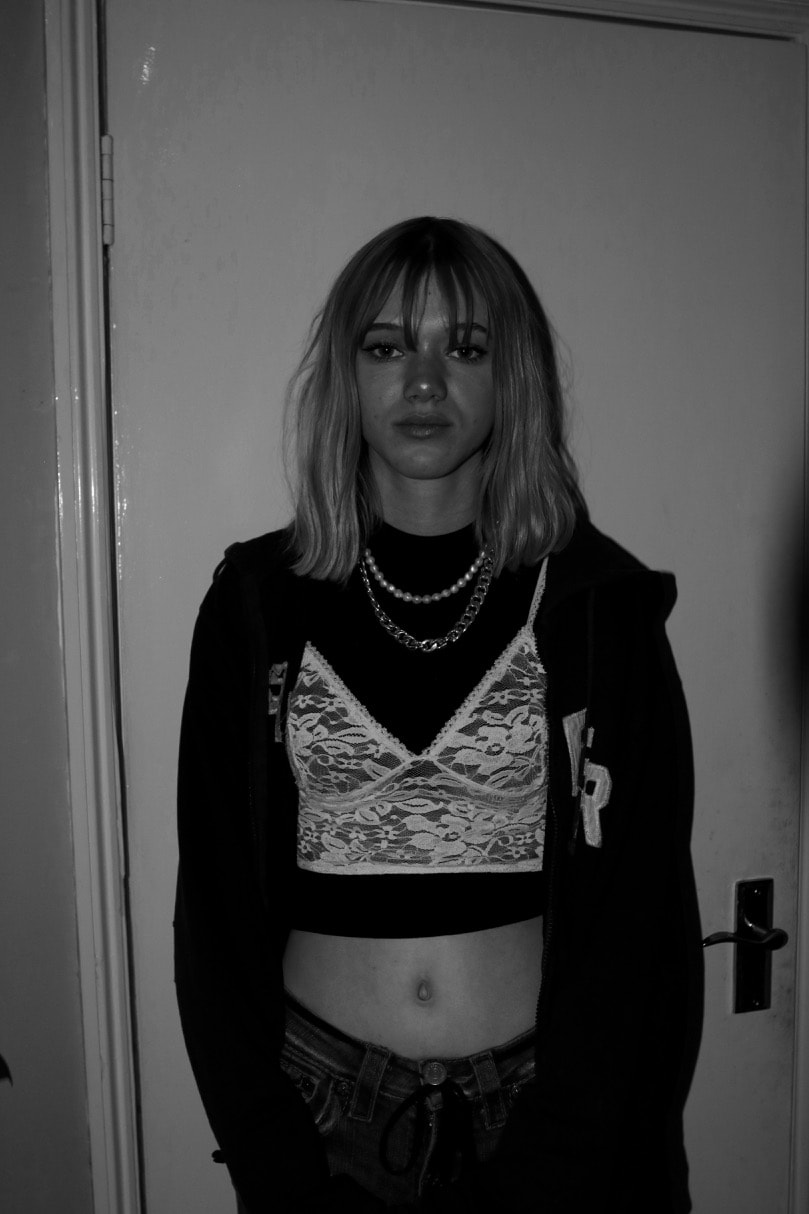
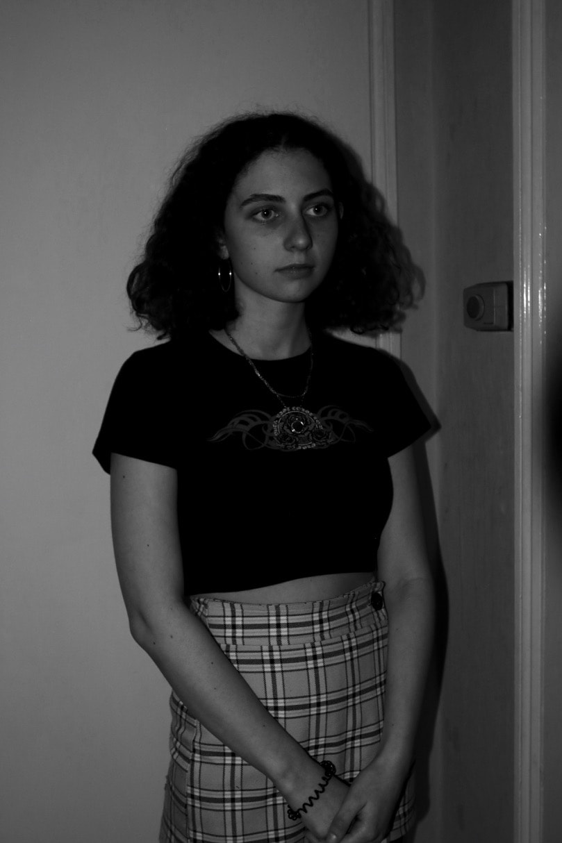
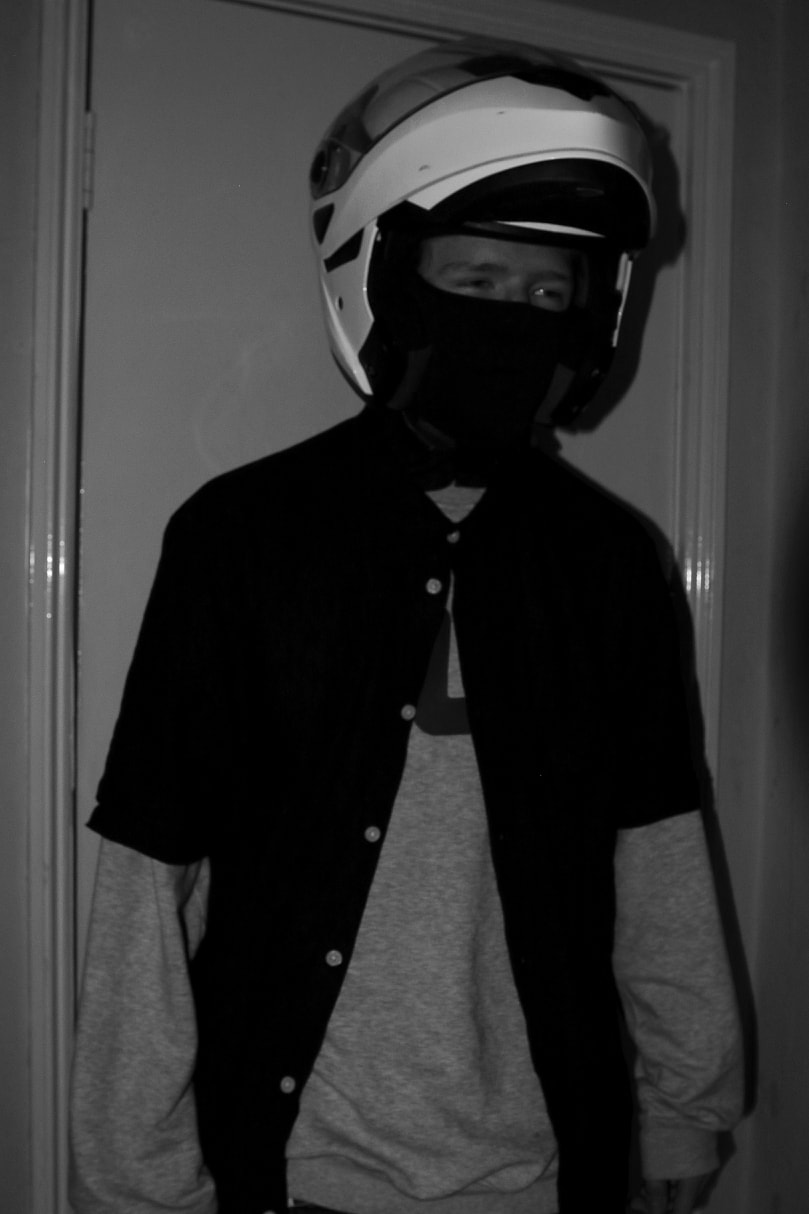
Rave Fashion, this is also something that I think can be very good to photograph and will be everywhere if you went to a rave, the fashion of the type of people who go to raves is very youth, careless but at the same time making an effort with the careless style. This will also give me a chance to photograph in a style that I don't get the opportunity to use, portraiture, I would really like to have a series of images in this photobook that were just portraiture and have pictures of people who go to raves/ are dressed similarly to that of the people who go to raves. Fashion is, in my opinion one of the easiest and best ways to express your personality, and this is a very apparent vibe that comes across from rave fashion.
Rave Fashion, this is also something that I think can be very good to photograph and will be everywhere if you went to a rave, the fashion of the type of people who go to raves is very youth, careless but at the same time making an effort with the careless style. This will also give me a chance to photograph in a style that I don't get the opportunity to use, portraiture, I would really like to have a series of images in this photobook that were just portraiture and have pictures of people who go to raves/ are dressed similarly to that of the people who go to raves. Fashion is, in my opinion one of the easiest and best ways to express your personality, and this is a very apparent vibe that comes across from rave fashion.
investigation into multiple photo books realting to my personal project
93: Punching the Light by Simon Burstall
|
Simon Burstall: 93: Punching the Light, published in 2019, is a photo book about Simon Burstall's direct experiences with the 1993 rave scene in Sydney Australia. I am writing about this book primarily because the subject is similar to mine and I think that the images depict the style and culture of Raving in the early 90s very uniquely and in a way that he was very unconsciously, his images were taken with the thought that he was just taking images for his own use and for him and his friends to look at and wasn't that serious at this point in his life.
|
|
These images relate to me work because I like the style, capturing small things happening but making them look really individual. This is what I was trying to capture with my images. Aesthetically, I am able to compare the fashion and environment side of his images to mine, a large difference though is that many of his images take place in the day light, when iconically, in London and England, raving now wouldn't take place anywhere other than at night, there are illegal sides to the raving scene in England therefore people have to be careful where they go and when they do it. During the same period of time as this raving would have been legal in England.
|
|
|
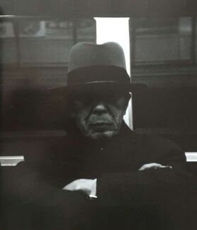
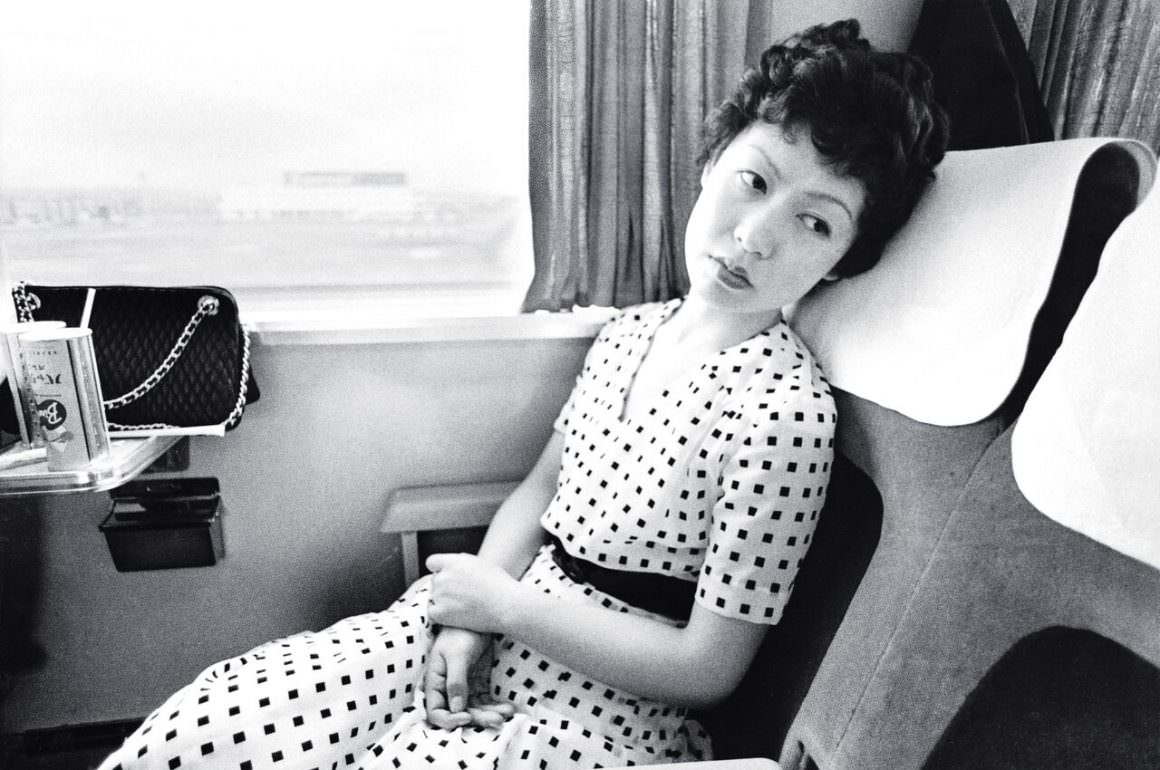
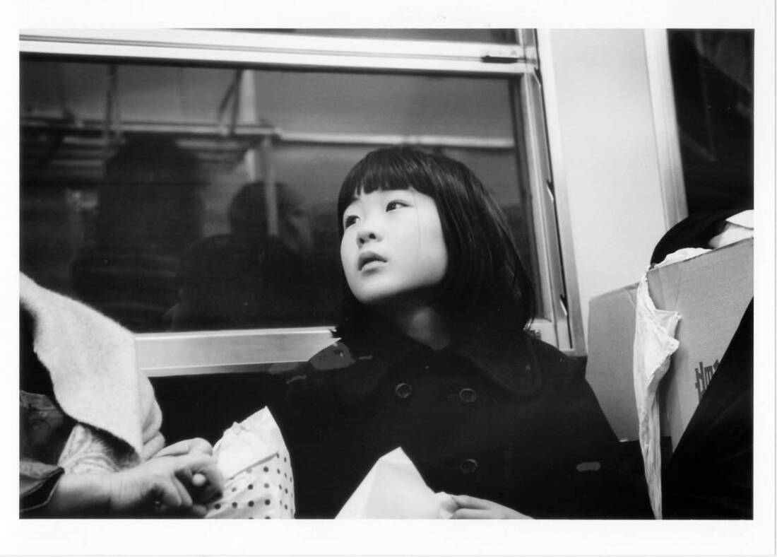
SUBWAY LOVe by NOBUYOSHI ARAKI
Subway Love - Nobuyoshi Arki, this photo book is a series of images of people on the Tokyo underground train system, the images consist of individual portraits of random people of the everyday working life in the capital city of Japan they take images of people on their way home or to work I decided to look into this photo book because I admire this style of photography, which is going to be a large segment of my photo book images are going to be focused on individuals. I am going to merge this style of photography with fashion photography to make my own photography focused on individual people and their fashion. In this particular photo book it has similar aspects to what I want to do, mainly focusing on individuals and the average teenager in London as appose to the average working adult in Tokyo.
|
|
|
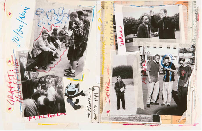
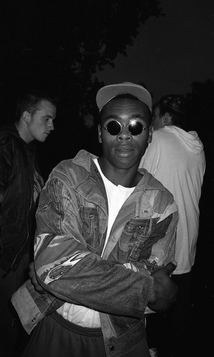
RAVING '89 by Gavin and Neville Watson
Raving '89, published in 2009, this is one book that I have been researching that helped me think about the images I wanted to take for my personal project to put in my photo book. The images in this book really depict rave culture and the style of who goes, what they wear, the sorts of things that happen, especially when raving wasn't a slowly dying scene, in the late 80s and early 90s. This photo book, highlights a time when there wasn't laws in place that incriminating people who went to raves.
Visually the images that have been used in this book made me think over more what types of images I was going to take for my personal project. This helped me conclude that I was going to take images highlighting the clothes people were wearing and combining that with the reoccurring events of going to a rave, e.g. public transport, colourful lights and music. This books main use as a resource to me was how it shows off the fashion and kinds of people who go to raves, I think it also stood out to me very clearly because it highlights a style from a period of time that you wouldn't see anymore whatsoever, so it's more noticeably from a different time. The photos are shot on film and it isn't difficult to tell, the images and style suit the subject matter in an interesting way in that the images look very home made and not particularly significant until you know what they are and the story behind them, similarly to raves these images feel very home made, I think that the images match the subject matter. In a way these images do feel amateurish in the way that it is that he just went to a rave and took images of random things that might have looked like something picture worthy, the images are amateurish but in a very stylish and tasteful way.
Visually the images that have been used in this book made me think over more what types of images I was going to take for my personal project. This helped me conclude that I was going to take images highlighting the clothes people were wearing and combining that with the reoccurring events of going to a rave, e.g. public transport, colourful lights and music. This books main use as a resource to me was how it shows off the fashion and kinds of people who go to raves, I think it also stood out to me very clearly because it highlights a style from a period of time that you wouldn't see anymore whatsoever, so it's more noticeably from a different time. The photos are shot on film and it isn't difficult to tell, the images and style suit the subject matter in an interesting way in that the images look very home made and not particularly significant until you know what they are and the story behind them, similarly to raves these images feel very home made, I think that the images match the subject matter. In a way these images do feel amateurish in the way that it is that he just went to a rave and took images of random things that might have looked like something picture worthy, the images are amateurish but in a very stylish and tasteful way.
|
|
|
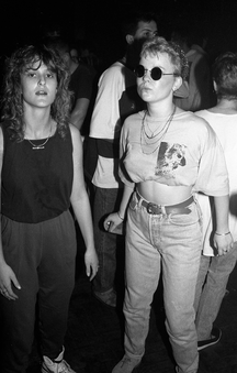
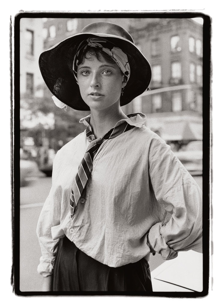
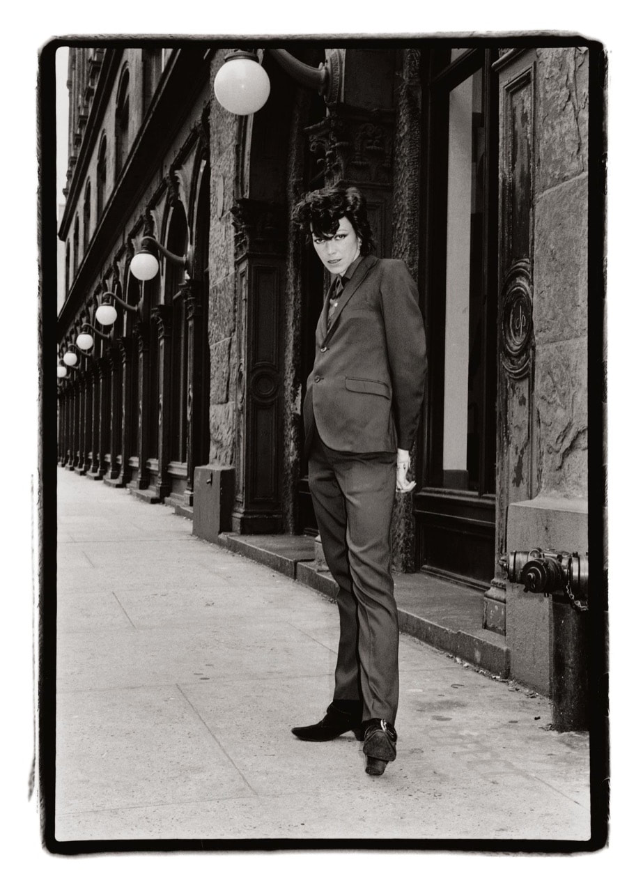
On the Street: 1980-1990 - Amy Arbus
Amy Arbus was a street photographer who took images for a monthly column, 'on the street' in a New York magazine known as 'village voices', her images in these columns were known for their 'edginess' and style that highlighted street photography and fashion. On the street 1980 to 1990 is a book of these images in those columns. I decided to study this photo book because of the two main aspects of her images, street photography and fashion photography. Street photography is very useful and relates a lot to the subject of my personal project, the style of raving and the culture, involves a lot of being around lots of people at a public event and I think that using street photography to show raving and the lifestyle that surrounds it would be really useful. In the same way a huge part of raves and the culture of raving is fashion, people who go to raves have a certain style and attire when they attend these events and this in my opinion the clothes people wear is a personal statement when going to raves. What I most admired about these images was the focus it has on individuals in each picture and how these images can highlight the vibrant and vast different people who live one area or in my case the different people who go to raves.
|
|
|
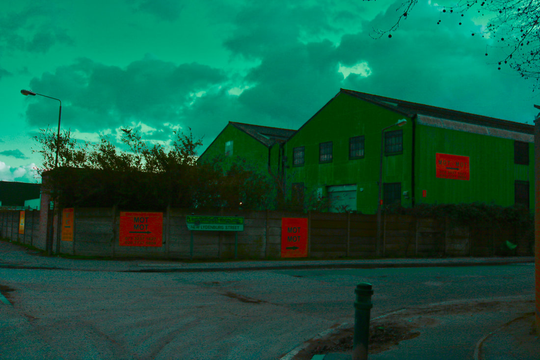
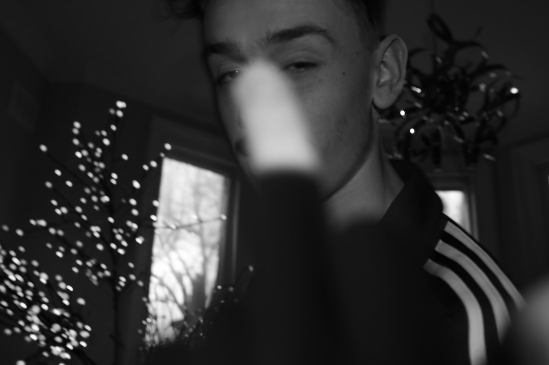
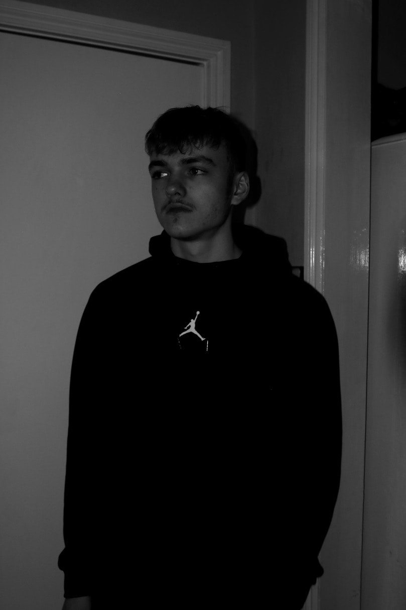
initial Rave culture and fashion images
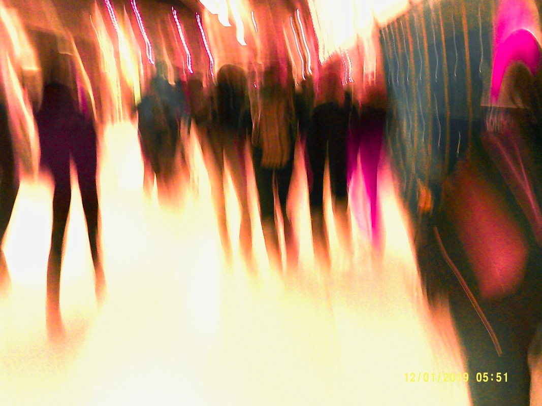
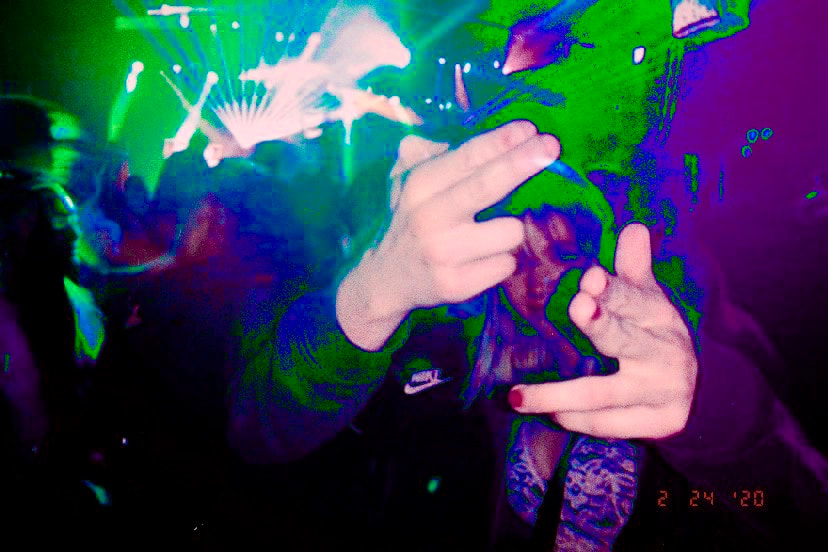
This is a collection of images that I formed over the course of one night. Before taking the images I prepared by doing two things, the first being, buying a small, compact camera which took images with a certain style which I thought matched the style of this project. The second being planning my images, I wanted to have about 10-15 portraits focusing on individuals and their fashion/style, about 10-15 images using my eye and trying to spot interesting things that I thought could be used in this photo shoot, I wanted these to be mostly street style photography. The outcome of these images is pretty much what I wanted, the images came out looking a lot more colourful than I first expected but this will also be edited even more to bring out the brighter, neon colours.


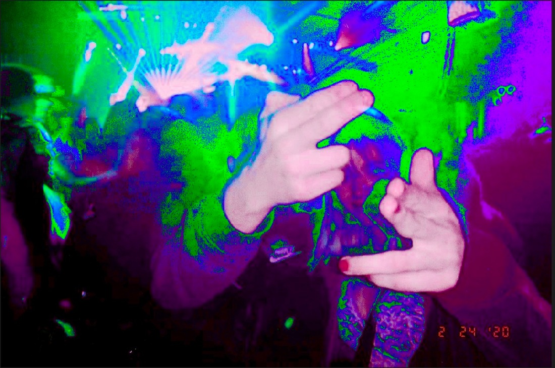
Rave culture and FASHION images (after editing and elimination)
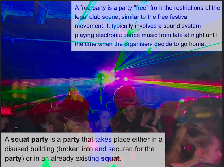
I decided to refine my images and make them more interesting, edit then more, take away a few, etc. First I wanted to make an image that had two definitions of "squat parties" and "free parties", I wanted to get creative with the image in the background and double expose two images or something similar to this. I also wanted to make a few double exposures on their own, I realised that I had some images which were very similar to each other, so I decided to make double exposures out of these. The main aesthetic of these images were the bright vibrant colours that I wanted to bring out in all of the images, I decided that this wasn't necessarily what was the best way of making them because looking at them, now they don't look that good, in a way they look very amateurish and as if I hadn't taken enough time to take the images.
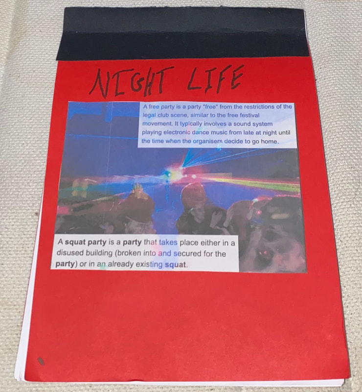
Prototype photo book
By the time I had made the photo book I had used the initial photographs and this is when I realised that I didn't want to use the over edited pictures, once they were in the book they didn't look good. I named it night life, this was simply a temporary name until I thought of something better, I chose the name night life because it relates to raving and how it has to take place at night. The name should differ in that I want it to be more abstract and hard to understand.
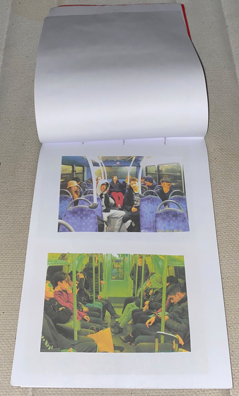
Photos without editing
In my opinion the photos do not look as good when they are edited as to when they are unedited I decided to also narrow this photoshoot down to 20 images, I am going to leave this photoshoot the way it is and take another photoshoot using a better camera and more carefully colour grade those images.
WWW
I like the way that the camera looks in photographs and the way it looks in a photoshoot.
EBI
I had taken more on the camera that I was using.
WWW
I like the way that the camera looks in photographs and the way it looks in a photoshoot.
EBI
I had taken more on the camera that I was using.

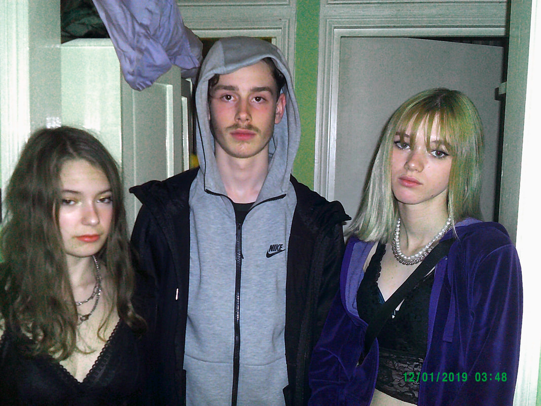
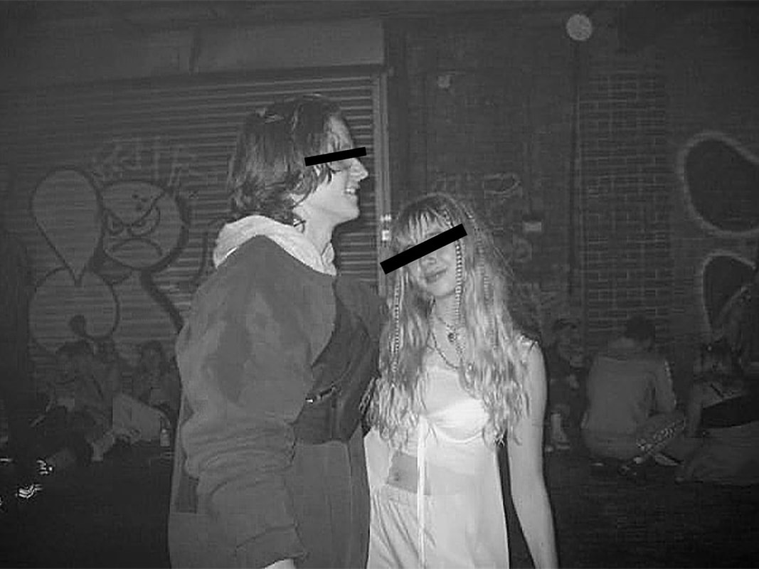
Second rave culture and fashion photo shoot
my aim for this new photoshoot of images was to make much more crisp images using a higher quality camera, as appose to the deliberately used lower quality images. One idea that came to mind was that I should use the higher quality camera for all of the new images I take but if there are pictures from the previous set of images that i took that might fit in with the new photo shoot.
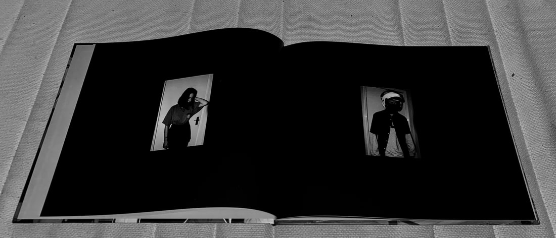
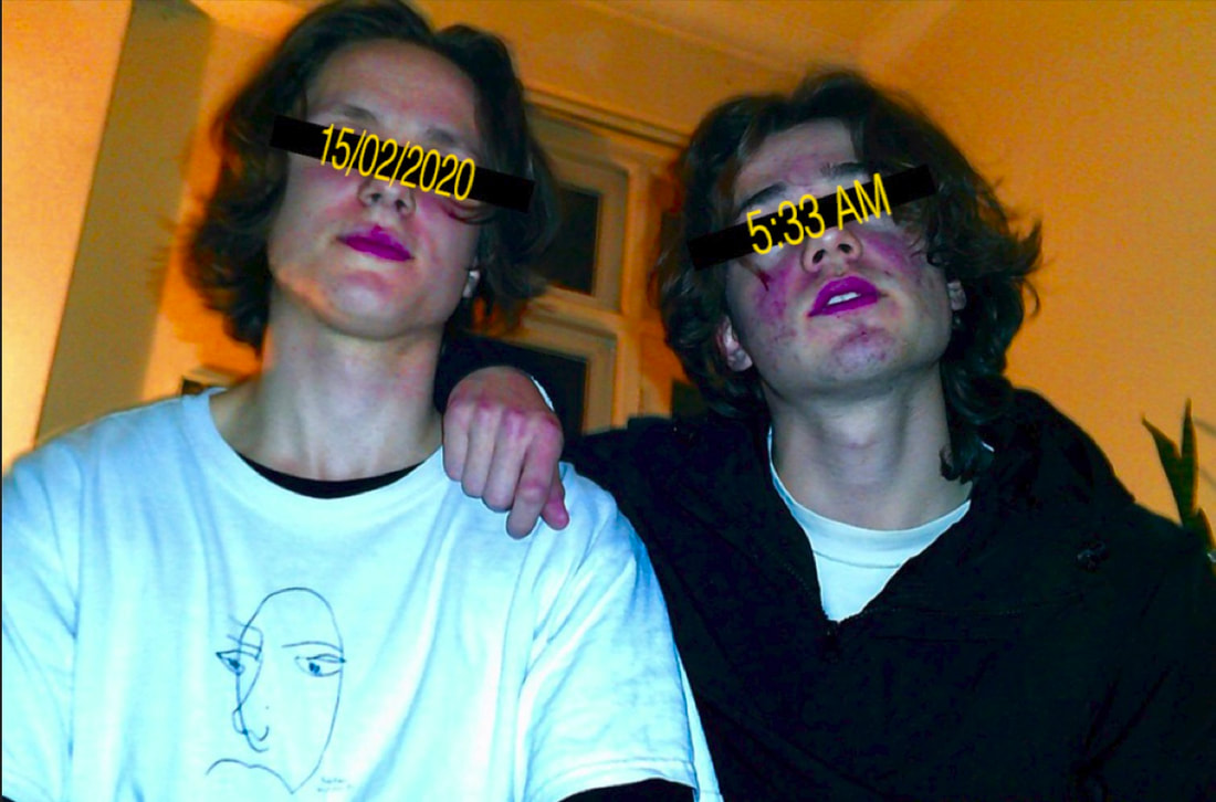
portraiture
The difference that I wanted to make with my portraits is that I wanted them to be more crisp and higher quality, I also wanted the images to have a more clear, connected flow. Firstly I retook all of the images of people standing on their own inside, I thought that these should most likely the sharpest and clearest out of the portraits, in editing I made the sharpness very high and the the blacks really dark, so they have this old crisp effect which is what I wanted them to look like.
The rest of the images are a mix up of group pictures and a couple of abstracted/distorted ones , these weren't as crisp, these were more shots that had quite dramatic lighting.
The rest of the images are a mix up of group pictures and a couple of abstracted/distorted ones , these weren't as crisp, these were more shots that had quite dramatic lighting.
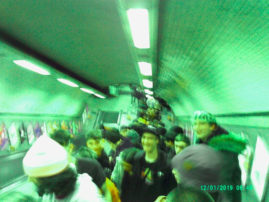
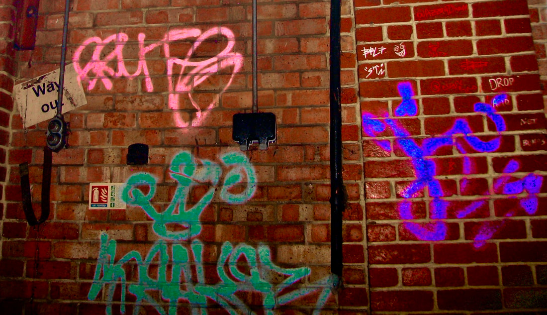
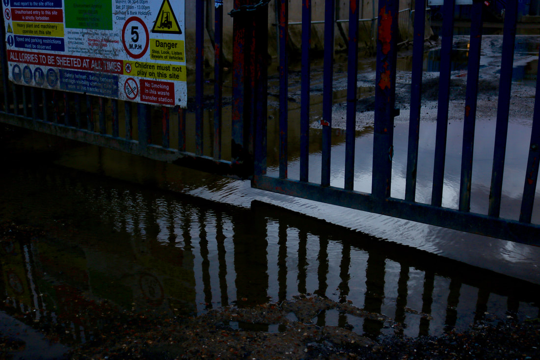
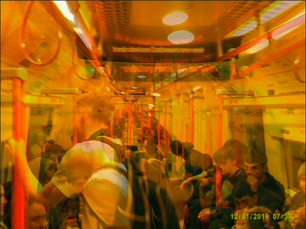
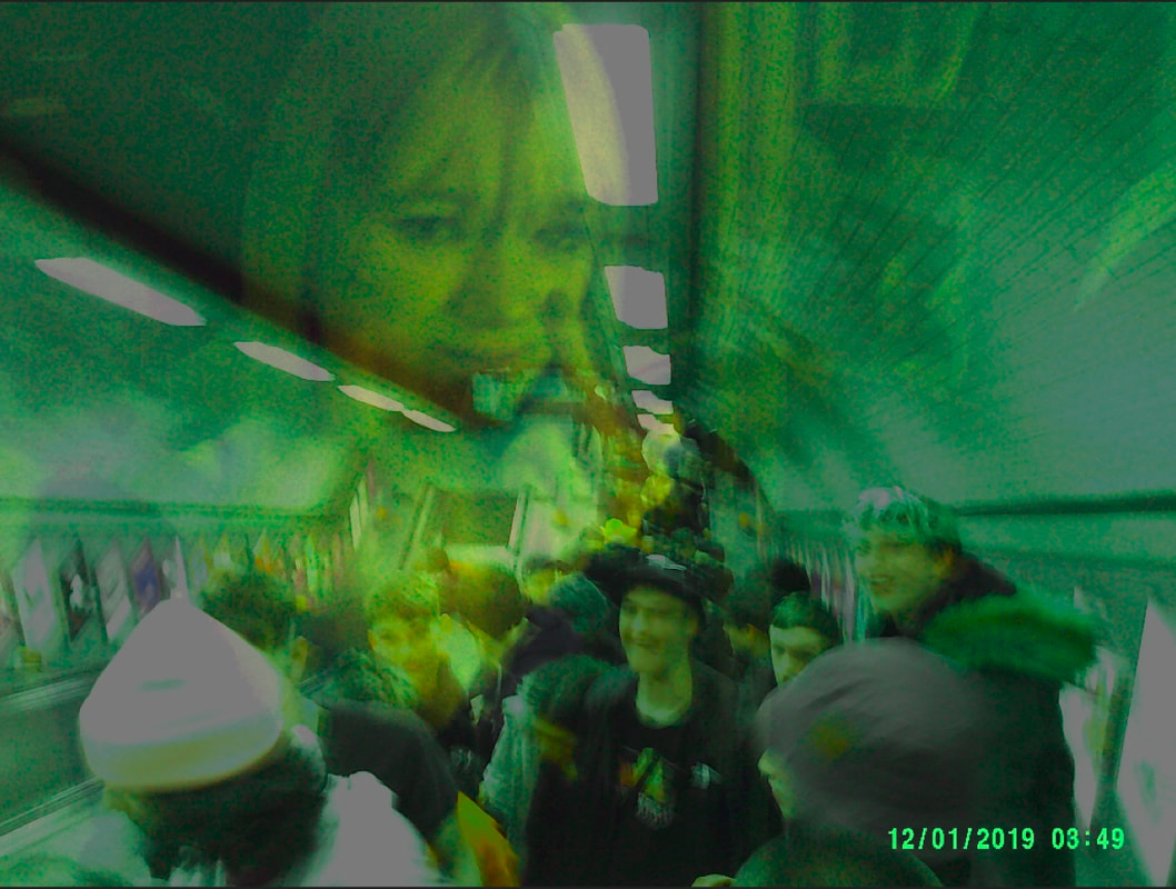
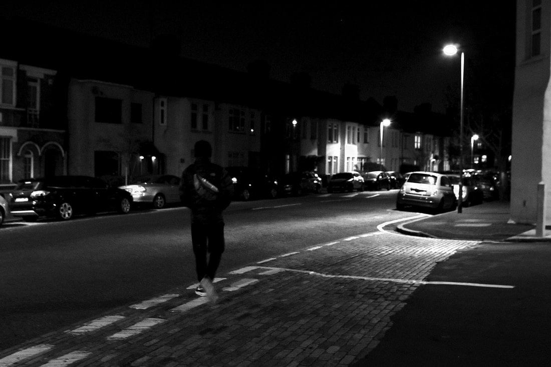
street photography/action shots
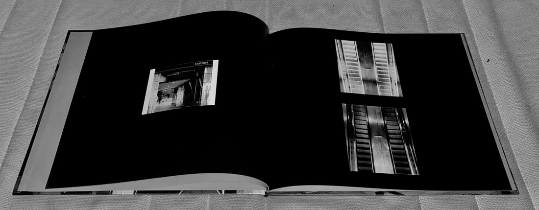
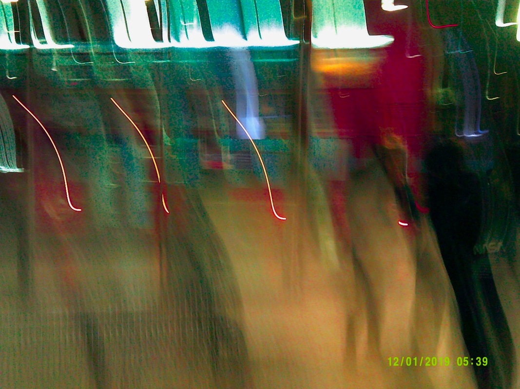
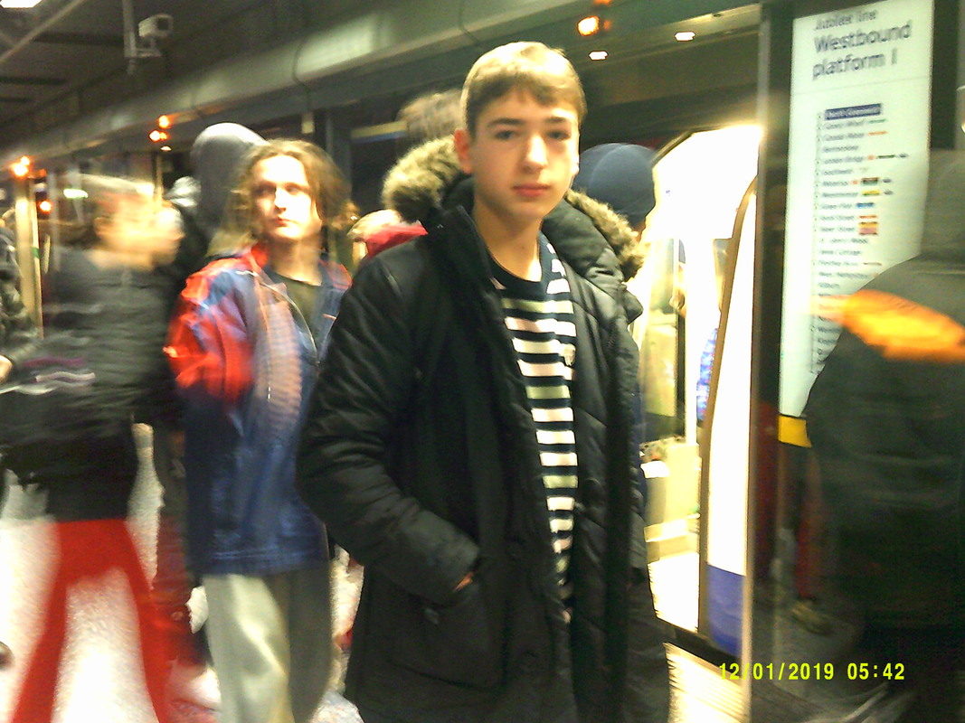
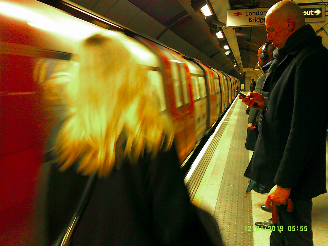
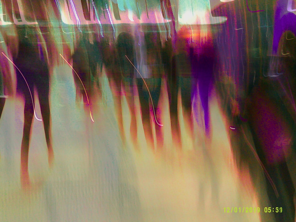
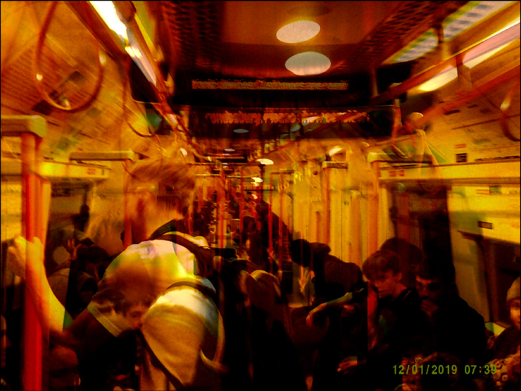
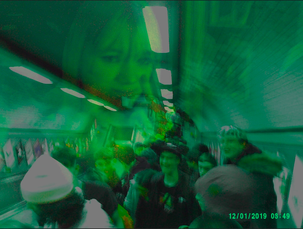
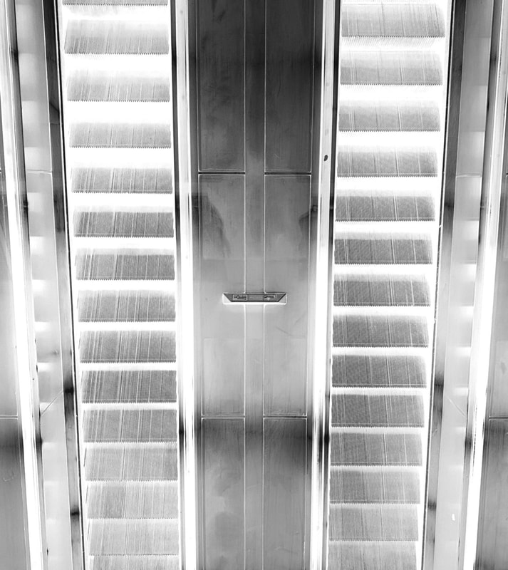
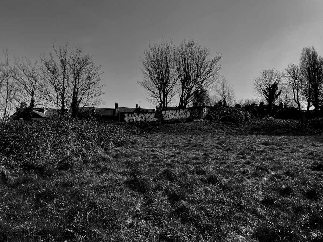
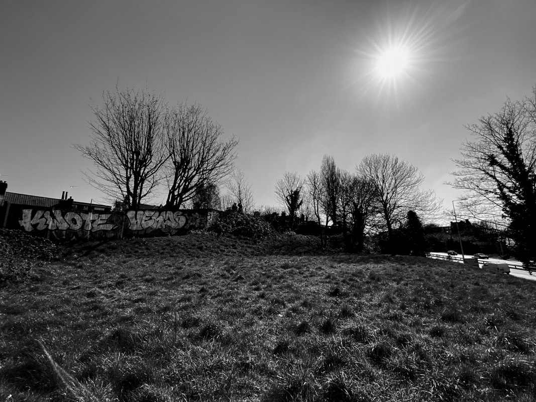
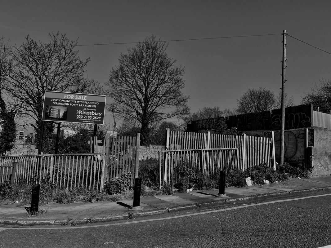
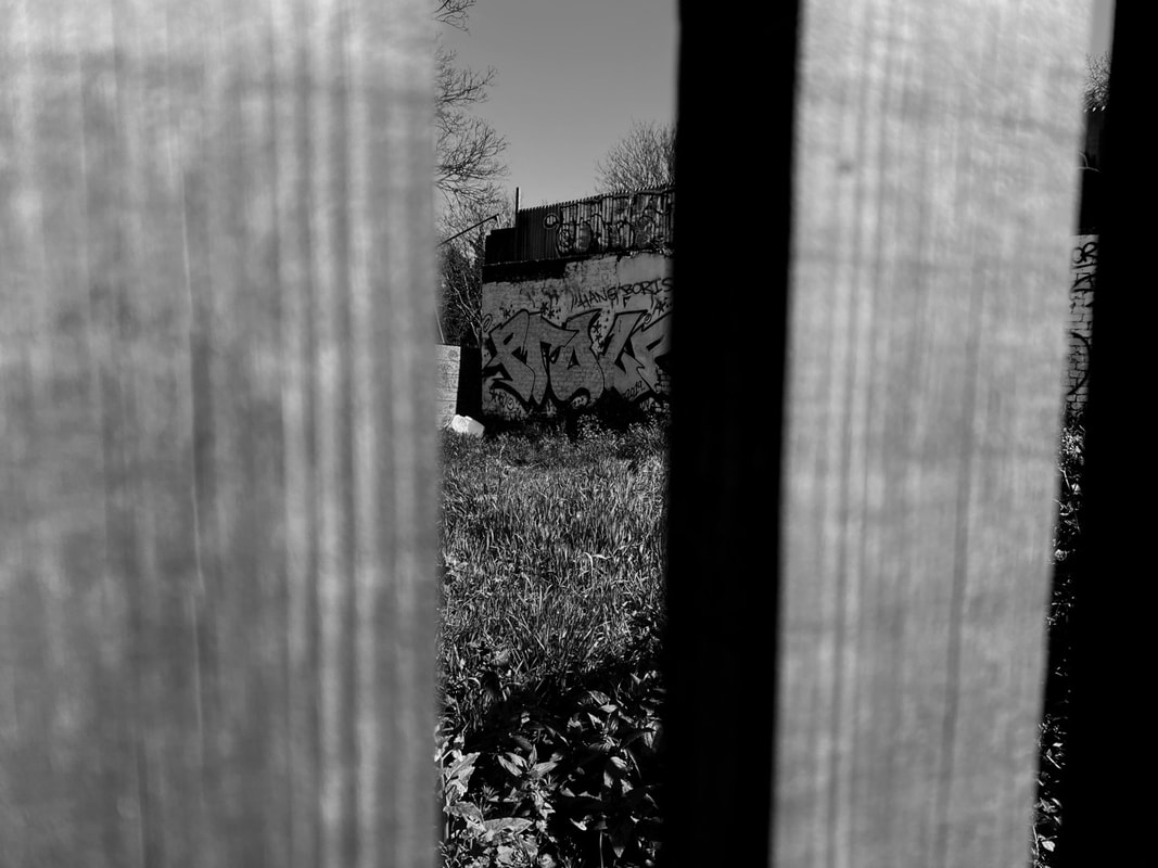
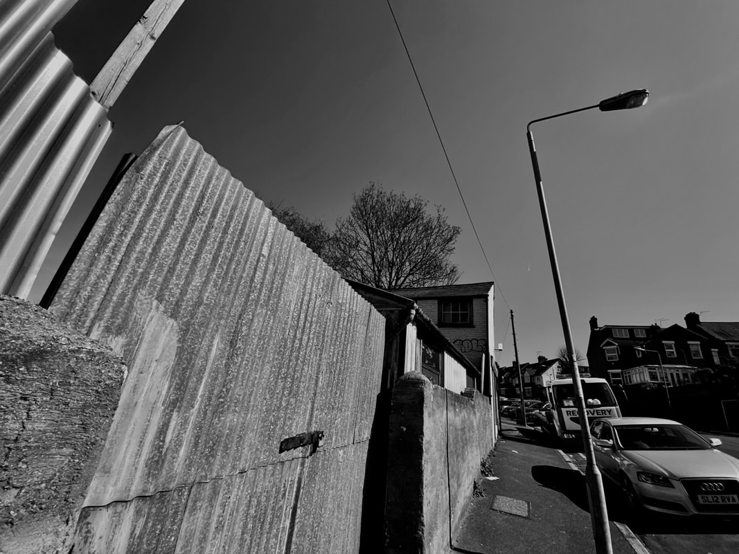
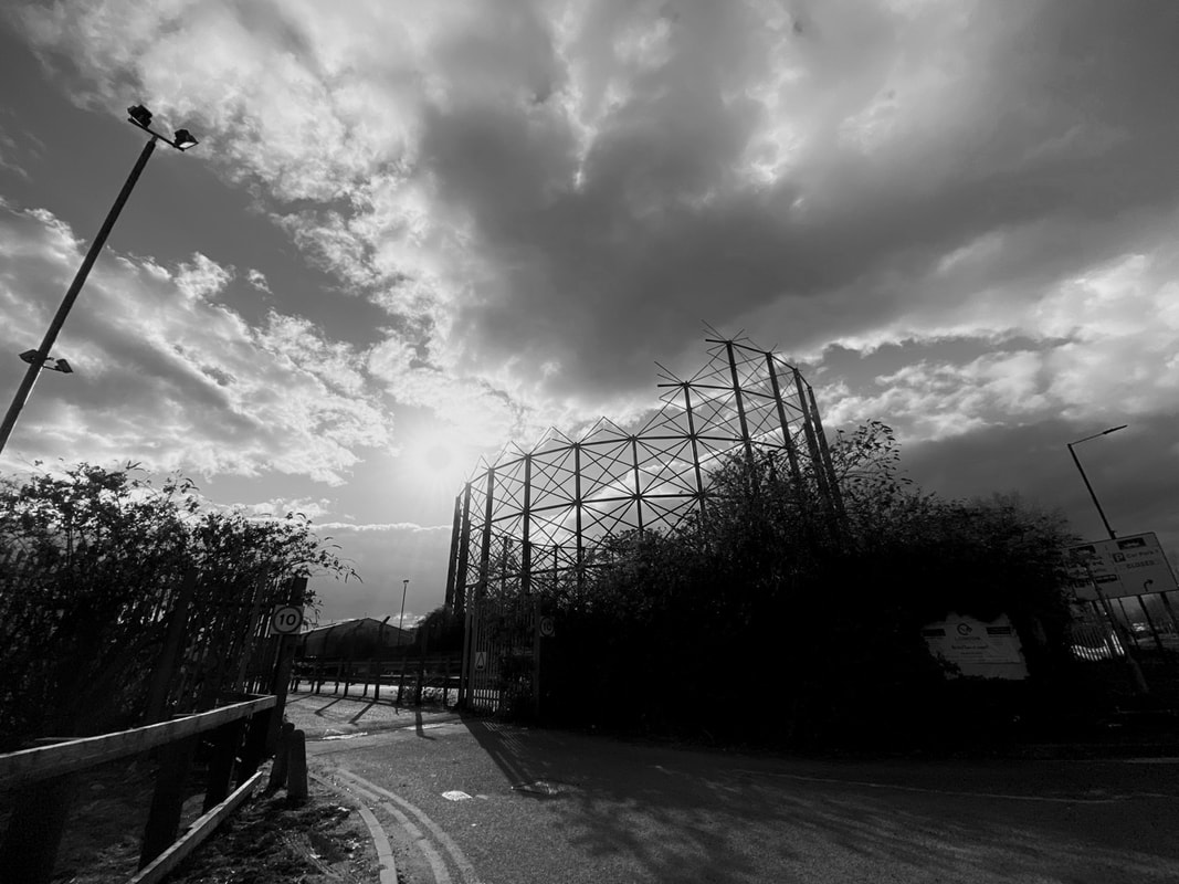
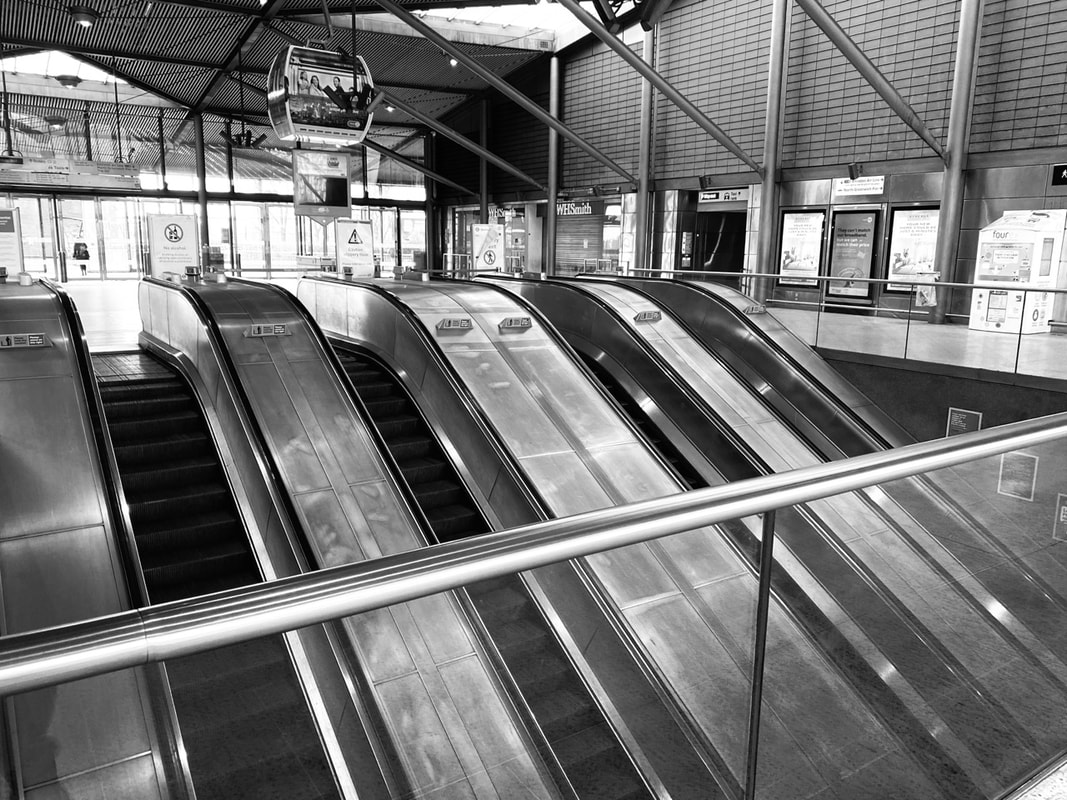
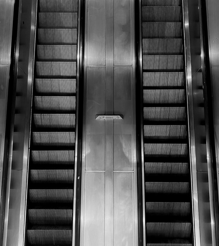
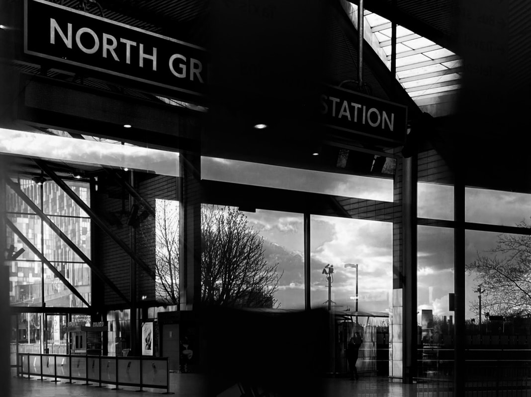
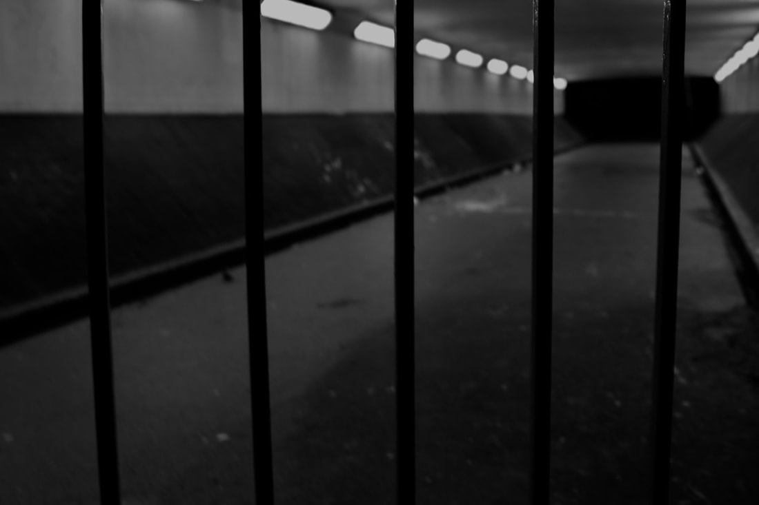
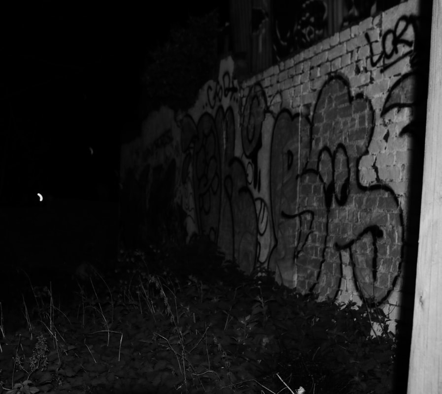
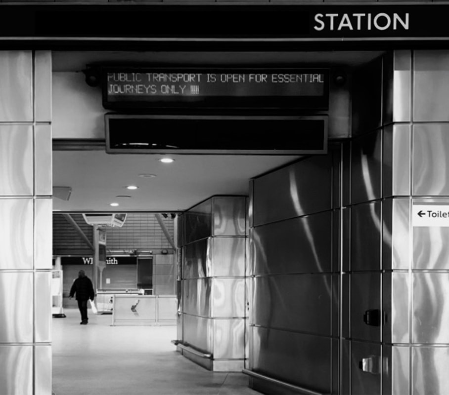
With the street shots, this is where I wanted to make them much more gritty as oppose to the previous which were very distorted and colourful. The images i took had a subject matter of very urban places, places with graffiti, underground stations and roads.
The images of the underground were the most important images in the whole sequence, I wanted to go when the station would be completely deserted, so that the focus could be on the station and the environment of that place. I edited these to look very reflective and metallic to further the atmosphere.
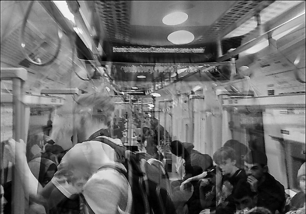
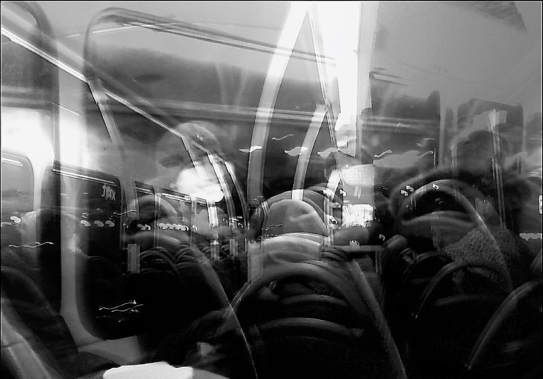
There are also two double exposures, these are made from the old images from the previous set of images, I wanted to keep these images and double exposures require quality the least out of any of the images so they still match the rest of the pictures.
The images of the underground were the most important images in the whole sequence, I wanted to go when the station would be completely deserted, so that the focus could be on the station and the environment of that place. I edited these to look very reflective and metallic to further the atmosphere.
There are also two double exposures, these are made from the old images from the previous set of images, I wanted to keep these images and double exposures require quality the least out of any of the images so they still match the rest of the pictures.
How I plan to make/manufacture my final photobook
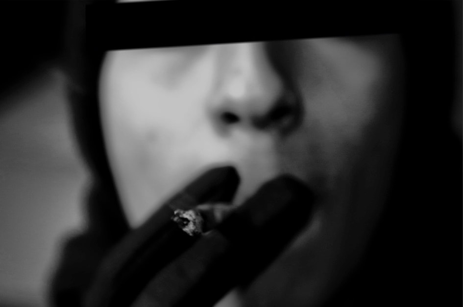
I decided to change the design of my book entirely after I made my prototype. My decision was to make a new book with new images, I thought that some of the images I had taken could still be used but my new images were black and white, taking away all colour and saturation, this was the main theme of my previous images as I was trying to depict the colourful themes of raving culture, however, one side of rave culture which id much prefer to show is the gritty side. I wanted to focus on the rituals and be a bit more personal about my images.
The books design wasn't the way that I wanted it to be, I wanted instead of a very bright cover and back, to be a very dark cover and back, therefore matching the images on the inside, I also thought that the pages should be black and have the images be smaller than the boarders of the page.
I started thinking about how I wanted my book to look very professional, I thought that I could achieve this by making a book at home but I was also looking into designing a book on a website called blurb, on this website, you chose the size of the book, whether the book is hard cover or paperback, the type of paper used on the pages, etc. after you design your book, you pay the charge of the book and order it, it then arrives at your house two weeks later. I made the decision to use blurb as my way of making the book because it would look the most professional and generally the way I wanted the book to look.
It took about a week from start to finish. The book that I had designed was landscape (33 x 28 cm), had 20 pages inside, was hard cover and had black pages. I chose hard cover because again I wanted to make my book as professional as possible, 20 pages was enough to fit my images inside in the sequence that I had planned. The design software allowed me also to design my own title. The books total cost ended with about 53 pounds excluding postage.
final book design/pdf
Final book
The book
The book was 20 pages long, landscape hardcover and was 33 x 28 cm in size. The general size and shape of the book I think matched the style of my images, it is a large book but not very long, 20 pages was a good length for my sequence of images and it helped to place each image properly somewhere in the book.
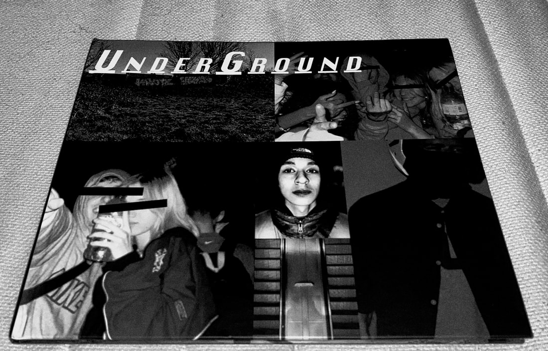
The front cover is a collage of images, this fills up the whole border of the front cover and some aren't in the book but most are, a majority of the images featured in both the book and the cover are cropped versions of themselves. The title reads, UnderGround with an individual underline under each letter. The name Under Ground is a good name for the book and the name originated from the ritual of frequently going on the underground as a mode of transport to get to raves, there are various images of the underground in this book, so the name matches the contents and theory behind the book.
The back cover is just one image, it doesn't have a smaller frame so it fills up the whole page, the image is from the inside of the book.
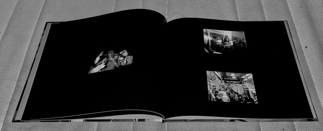
The pages are black, I did this deliberately so that they blend in with the black and white images, the paper is shiny and thick, I like this because it has a higher quality feel.
The subject matter is rave fashion and culture, the design of the book helped me to depict raving in a way that I was pleased with, it helped to have a much more gritty atmosphere, I think the best example of how this was conveyed was the back cover, I deliberately used my gritty street pictures on the front and back cover so that it is the first/last thing that you see on the book.
The images get more and more abstract as the book goes on as well as getting more gritty, the first image is a clear, high-quality image of a girl and the last being an abstract image of a station name through the glass.
The camera quality is very high because that way it can capture very average but interesting moments in a very detailed crisp way. The way I would describe the images would be, intimate and well-paced. A combination of the book's style and sequencing I think helps to emphasise the subject matter.
The book fits very much with what I was looking to make and there are many aspects to this. I thought that the front and back cover, most importantly looked interesting and enticing, this is a very important part of the book as it is the first thing that someone sees so there were two things that this needed, it needed to look good and to match the tone of the rest of the book, both the covers were the way I wanted them to be and the title matched the tone of the book also. The pages and images went hand in hand, they both worked well together and the images looked good on the black pages.
The only obstacle I can think of that happened would be when I changed the images, this I don't see as an obstacle but as a turning point, I think with the previous images I had tried very hard to make the images one thing when they would have looked much better being a different style, but when I took all of my new images which were in the book, they made a lot more sense along with the subject matter. I think that in terms of getting across the intensions and ideas which I had, it did very well. I think that it could have been improved by having more images, making it longer, at the beginning of the project I was thinking that with this project, it could be really long but, I then thought that a snappy shorter set of images might show it a bit better, enough images so that it was obvious what the book was about, but not so many that it gets boring/repetitive.
In conclusion, the book, in my opinion was a success and came out the way that I had intended, conveying the subject matter enough so that the subject matter is clear and having a well-paced sequence of images.
The book was 20 pages long, landscape hardcover and was 33 x 28 cm in size. The general size and shape of the book I think matched the style of my images, it is a large book but not very long, 20 pages was a good length for my sequence of images and it helped to place each image properly somewhere in the book.
The front cover is a collage of images, this fills up the whole border of the front cover and some aren't in the book but most are, a majority of the images featured in both the book and the cover are cropped versions of themselves. The title reads, UnderGround with an individual underline under each letter. The name Under Ground is a good name for the book and the name originated from the ritual of frequently going on the underground as a mode of transport to get to raves, there are various images of the underground in this book, so the name matches the contents and theory behind the book.
The back cover is just one image, it doesn't have a smaller frame so it fills up the whole page, the image is from the inside of the book.
The pages are black, I did this deliberately so that they blend in with the black and white images, the paper is shiny and thick, I like this because it has a higher quality feel.
The subject matter is rave fashion and culture, the design of the book helped me to depict raving in a way that I was pleased with, it helped to have a much more gritty atmosphere, I think the best example of how this was conveyed was the back cover, I deliberately used my gritty street pictures on the front and back cover so that it is the first/last thing that you see on the book.
The images get more and more abstract as the book goes on as well as getting more gritty, the first image is a clear, high-quality image of a girl and the last being an abstract image of a station name through the glass.
The camera quality is very high because that way it can capture very average but interesting moments in a very detailed crisp way. The way I would describe the images would be, intimate and well-paced. A combination of the book's style and sequencing I think helps to emphasise the subject matter.
The book fits very much with what I was looking to make and there are many aspects to this. I thought that the front and back cover, most importantly looked interesting and enticing, this is a very important part of the book as it is the first thing that someone sees so there were two things that this needed, it needed to look good and to match the tone of the rest of the book, both the covers were the way I wanted them to be and the title matched the tone of the book also. The pages and images went hand in hand, they both worked well together and the images looked good on the black pages.
The only obstacle I can think of that happened would be when I changed the images, this I don't see as an obstacle but as a turning point, I think with the previous images I had tried very hard to make the images one thing when they would have looked much better being a different style, but when I took all of my new images which were in the book, they made a lot more sense along with the subject matter. I think that in terms of getting across the intensions and ideas which I had, it did very well. I think that it could have been improved by having more images, making it longer, at the beginning of the project I was thinking that with this project, it could be really long but, I then thought that a snappy shorter set of images might show it a bit better, enough images so that it was obvious what the book was about, but not so many that it gets boring/repetitive.
In conclusion, the book, in my opinion was a success and came out the way that I had intended, conveying the subject matter enough so that the subject matter is clear and having a well-paced sequence of images.